Google’s Mobile-First Index: What Business Owners Need to Know
Google's shift to the mobile-first index will be complete in March 2021. Here's what business owners need to know.
In March 2021, Google will be changing its index from the current desktop-first index to its mobile-first index.
This is one of the largest shifts to Google’s algorithm since its inception and one that they’ve been preparing for, for years.
While that shift is still several months away (at the time of this writing), 2020 has been anything but predictable. Here’s what you, as a business owner, need to know to get ready.
63% of searches are on a mobile device
While exact numbers about how many Google searches are completed on a mobile device isn’t public information, studies such as this one suggest that it’s at least 60% of total searches.
We know that since at least 2016, mobile search has accounted for “most” of Google’s traffic because that’s when they started working on the mobile-first index.
What does that mean concretely?
With over 3.5 billion searches per day, that means 2.2 Billion searches are happening on a mobile device. Each day.
While mobile search frequency can vary by industry, in general it is more likely that your customers are visiting you on a mobile device instead of a desktop.
Since July 2019, all new websites are already being indexed on the mobile-first index
For any new websites – that is, new to Google or their index – created after July 2019, your website is already being indexed on the mobile-first index.
If your website existed before July 2019, it is likely still being indexed by the desktop user-agent.
Pro Term: A user-agent is a piece of software that acts on interacts with web content on behalf of a user. For example, your web browser parses web code and renders it for you to be able to interact with it. Google – and other entities – user their own “bot” user-agents to interact with web content, too. That’s how the index gets created.
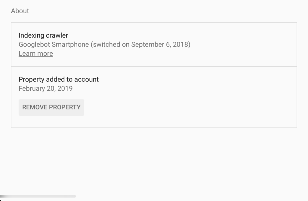
To verify your site is being crawled with the mobile-first index, log into Google Search Console and click “Settings” then scroll down to “About.” You’ll see there something that says “Indexing crawler” and will tell you if the Googlebot Smartphone bot is crawling your website or not.
The index will be consolidated
It’s a bit of a misnomer to think of the mobile-first index and desktop index as two separate entities after March 2021. At that point, there will only be one index – the mobile and desktop indexes will be consolidated into a single index crawled by the Google Smartphone bot.
Specifically, this means instead of the desktop version of your website being used for indexing, the mobile version is what will be indexed…and ranked.
If, in the rare case, your mobile site is subdomained (e.g., m.website.com is your mobile site and www.website.com is your ‘main’ site), the subdomained mobile site will be the one indexed.
You can’t force move to mobile-first indexing. And you can’t opt out.
You don’t have a choice about when your website switches to mobile-first indexing or whether it does at all.
Since 2018, Google has been moving sites to the new index incrementally, starting with all new websites (see above). How they determine when a site moves is, like most things “Google,” a mystery.
What we do know, though, is that March 2021 is the rollover date for everyone in the ‘final’ batch of websites.
Here are two of Google’s team members talking about the rollout. Around minute 25 is when they discuss the migration timetables.
Mobile-first is about more than ‘fits on a mobile screen’
What constitutes a ‘mobile-first’ approach to your website is about more than ‘it looks good on a mobile phone.’
Those are table stakes.
For a mobile-first approach, performance matters as much – or more – than looks. Especially speed.
Since mobile devices are generally on some sort of networked connection, the Google Smartphone crawler mocks a 3G connection to render and index your webpages. That means the website that looks good on your phone when viewed on wifi might still rank poorly in Google’s index because it performs poorly on slower connections.
To ensure your website is ready for the switchover to mobile-first indexing, your website should load quickly on a 3G network.
Mobile-first augments traditional “SEO” practices
Keywords still matter. Meta tags still matter. Good, rich content still matters.
The switch to a mobile-first index doesn’t negate anything we’ve learned in the past about traditional SEO. Instead, it raises the stakes. It will no longer be enough to have ‘keywords’ in the ‘right places,’ your site should load quickly. It should incorporate structured data. It should be accessible.
The web is more sophisticated than it was when Google launched circa the year 2000. Contemporary websites need to reflect that if they want to be indexed favorably by Google.
Get Your Visual Content Under Control
People are visual creatures and good-looking websites tend to be more engaging than ugly ones. That said, images, videos, and other media can often slow websites waaayyy down if they’re too large or unnecessary.
Our recommendation is to try and get your images under 300kb when possible. Using .webp, .jpg, or .svg instead of .png files can help. Re-sizing images down (especially if they were taken at a high resolution) can help. Loading image from a CDN with a cache-control header way out into the future can help. Everyone’s mileage will vary and the more content-heavy your website is, the more opportunities for optimization there will be. And the higher the stakes.
Want to learn more about image optimization? Check out our post “How to Optimize Your Images for Speed“
Compress Your Files
We’ve written about this before, but compressing CSS, JavaScript, and images can make a big difference on page load times. More specifically, compression shrinks the size of a web page, meaning that there’s less content to load.
For example, a page that’s 2.5MB large will load faster than one 3MB large because it’s 20% smaller. Needless ‘fluff’ created by your website builder or poor coding practices can very quickly add heft to your website with no obvious benefit to a website visitor.
Clean up your Javascript
Javascript is the coding language used on the web that makes content dynamic or interactive. Any time you click a button and something moves, pops, or shifts, JavaScript is driving the change. When pictures are changing in a carousel, JavaScript is driving it. Any time data is being retrieved and manipulated on your screen…yup, JavaScript.
Suffice it to say, the modern web wouldn’t exist without JavaScript. Or, at least, it would be a lot less interesting.
But extra functionality and extra code can come at a cost. This cost can be in the form of carousel code loading on every page – even ones without the carousel. Or inefficient coding practices that make the carousel super cool, but unnecessarily heavy.
More sophisticated websites written purely in JavaScript that fail to take advantage of server-side rendering can actually make it virtually impossible for a website to be indexed. But, if you understood that sentence, you already know that (and probably have a plan to optimize it).
For most business owners (and many webmasters), unpacking the role of JavaScript SEO is likely going to be beyond the scope of your skill set. You will likely need a developer to help you with this dimension of SEO. Thankfully, this level of consideration likely only matters if you have a pretty sizable, interactive website.
For small websites, it’s important to avoid ‘cool’ bells and whistles that don’t serve any meaningful purpose so you don’t add unnecessary bloat.
User-experience matters
I used to like Forbes.com. Until they started interrupting every single article with video ads and ads that shift the page while I’m reading.
Super annoying.
The new mobile indexing strategy will take user experience into account; penalizing websites that have a ‘poor experience.’
How will Google know that your website has a poor experience? Through the kinds of information you get on Google Analytics – how long a visitor is on your website. How many pages they visit. Whether they engage, interact, or convert. Or not.
But they also use metrics like how long it takes for the website to render it’s “above the fold” content. How long it takes before a page is useful. How long it takes for the whole page to load. Whether the page moves unpredictably while someone is on it (looking at you, Forbes!).
Poor user experience = poor ranking.
Submit your website to Google
If you haven’t already, make sure you sign up for Google Search Console and verify your website’s connection to Google. Then, any time you make a significant change to the site, resubmit your website’s’ sitemap to Google’s index.
While this won’t force Google to re-index your website, it does keep a current record on file with Google of your website’s important content. If you use WordPress, plugins like Yoast can do this for you automatically (once you connect it to Search Console).
Https > Http
This has already been a part of the index, but we see enough ‘http’ or ‘mixed content’ websites that it’s worth bringing up again.
Encrypt your connections with https.
Trustworthiness is a key component of the Google algorithm and insecure URLs diminish trust. At this point, it’s easy to get and install SSL certificates, so no excuses.
Getting ready for roll out
The reality is that the web is more cluttered – and more competitive – than it’s ever been. With the mobile-first indexing change coming up in a few months, we should expect to see dynamism in rankings.
To make sure you’re ready for rollout, there are a few things you should do:
- Check Google Search Console to see if your website is already being indexed by the Google Smartphone bot.
- Test your website on Google’s Mobile-friendly Test
- Test individual webpages on Google’s PageSpeed Test as well as Pingdom’s Test
- Get an SSL certificate if you don’t have one
If you’re serious about SEO, you should order our Website Speed Audit for $199 or our book a call with a Pro to get a free SEO consultation. With these, we’ll provide you an interactive report that shows you how your website is doing and give you a roadmap for improving it.
Or, if you sign up for one of our Unlimited Web Design plans, we’ll work with you to get your website as optimized as it can be, given your business constraints.
Google’s shift to a mobile-first index is one of the most significant changes to the Google index since it launched nearly 20 years ago. The shift reflects the higher level of technical acumen required to create a fast, engaging website that can compete will on all networks and devices. If the prospect of managing all that is intimidating to you, we invite you to reach out and book a call with a Web Pros.
We’d love to help you out.
Also from the Pros...

5 Landscaping Company Homepage Designs That Make You Dream of Paradise!

5 Manufacturing Company Homepage Designs That Need Re-Manufacturing (The Last One’s Unbelievably Hilarious)

5 Manufacturing Company Homepage Designs That Demonstrate Excellence

5 Pest Control Company Homepages That Exterminate Their Chances of Getting New Clients

5 Pest Control Company Homepages That Make Rats and Roaches Scared!

5 Bank Homepages That Make You Hold On To Your Money Instead of Depositing

5 Bank Homepage Designs That Inspires You To Invest
