5 Bad Examples of Real Estate Homepages That Make Readers Close Their Browser
Discover key design flaws in five real estate homepages and learn how to improve your website for better customer attraction.
The competition is fierce in the real estate industry. Even in the digital space you want to make sure you put your best foot forward because every step of interaction you have with your customer both online and offline has to leave a good impression. If you’re not taking care of your digital space, that might not reflect well on your brand or company. How are you making the browsing experience for your customer on your website?
Looking at websites that rank very far in the search results related to real estate, we were able to find some homepages that need a makeover. Some of them aren’t exactly the worst websites but they broke some rules in good homepage design. Scroll down more and find out why these 5 homepages are what we consider, bad examples.
Results Real Estate
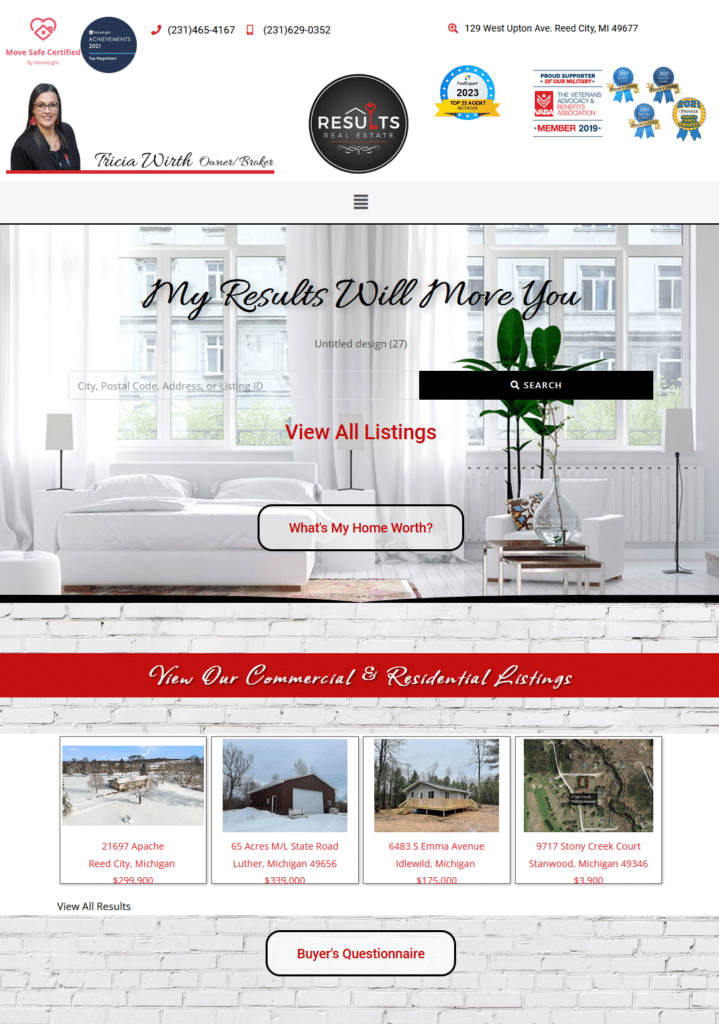
Designing a home is all about functional spaces and arranging elements in the home so that there is a flow and everything is in order. This website is an example of how you shouldn’t place too many things all at once. Where should I focus? Is this website by a company or a broker? It’s almost as if, instead of focusing on providing solutions or answers for readers.
Take for example the search bar. If you thought that black bar that says “search” is where you type the text then you are wrong. That’s the button. There’s even a leftover text that says “Untitled design (27)”, which upon refreshing turned out to be a gif. Cleanliness and clarity means arranging elements to make it less overwhelming for your homepage visitor.
She might have gotten it right with the listings selection underneath but the homepage overall could do with some cleaning up.
Alembic Real Estate
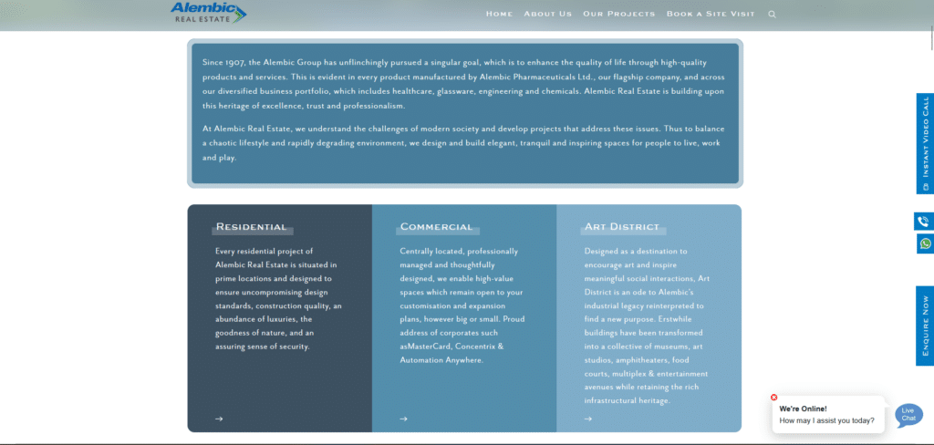
Now to be fair to this homepage, it’s not bad. The theme is nice, the choice of colors, could improve but still already following modern design. Good call on the live chat assistance because that is very helpful. Where it failed as is in simplifying the copy. Homepages are brief overviews and are focused on brevity and clarity.
Having this whole bunch of text spread out, which isn’t exactly easy to read, can be a bit too much. While the goal to provide information in 3 important segments of their business is there, it fails to inform in as brief as possible. If you want to add more details then you can add a CTA (Read more/Learn more) after a short copy and that will lead to the page for each of these segments.
Indigo Homes (Ghana)
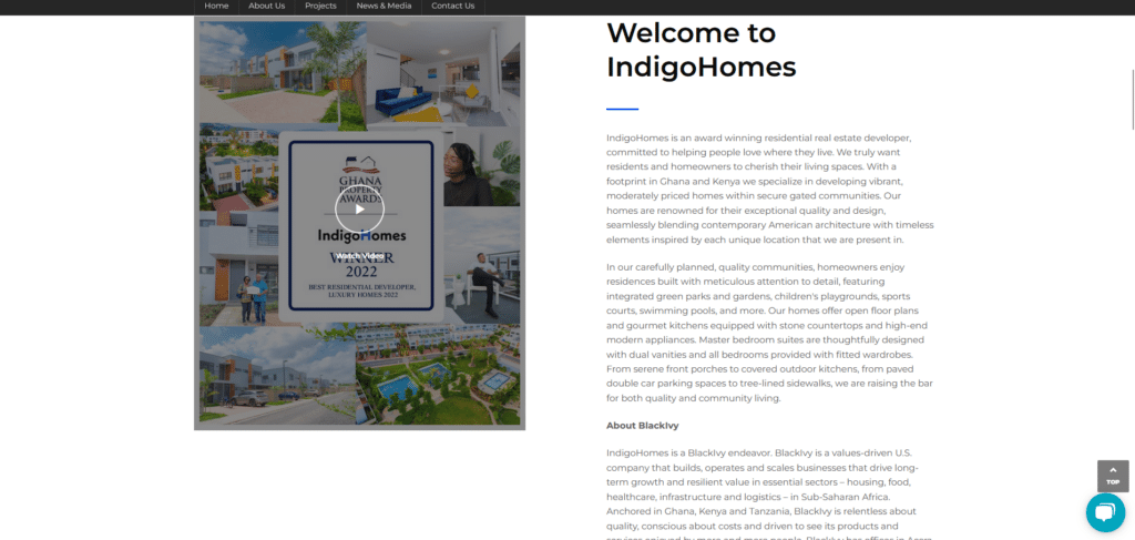
Another case of almost there but not yet. They got some elements right, arranging information for easy access, and easy channels of communication. However this is another case of copy overload. Too much to say in a homepage instead of focusing on connecting and relating with the reader.
Your copy shouldn’t focus so much on showcasing who you are and instead should make the reader feel like you’re relevant to the query in search that brought them to your homepage in the first place. If you really want to show off your brand, you can do a section in the middle of your homepage with a brief explanation of why your brand is the best and that can lead to a more detailed about page.
Keep it clean and simple!
Velociti

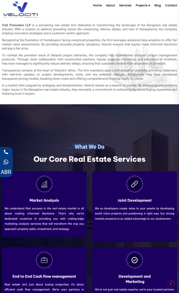
For this homepage I had to take two screenshots. For the first image you can already see just how big a section is provided for the logo. Then underneath the logo is a text that you can’t read at all. They should have shrunk the logo, cropped the subtext and made it look cleaner. Then you have a top ribbon which also welcomes you to Velociti followed by some social links.
I mean, it’s helpful but you want to provide links to your social elsewhere and instead give more focus on the important page links as well as contact information. This is another “almost there, but not yet.”Now for the 2nd screenshot, another case of using the homepage like a brochure (and even brochures need to simplify).
Keep the copy direct to the point and engaging so people are more likely to read instead of just scrolling past it.
Bangaloreproperties.com
If we are to age websites I think this website is a millennial. To be fair, they rank in Google search. However, if I were searching for properties, I don’t think I’d like to read through all the clutter in this homepage and I wouldn’t even know where to start? I added this homepage because I wanted to show you what it was like back in the late 90s early 2000s.
People didn’t think much about design optimization and user experience back then. Now it’s all about making it a smooth experience for the user.
Make Them Feel At Home
It takes some level of consideration and humility to stop focusing on showing off one’s brand and credentials and instead focus on “how can I help my reader?” When you have shifted into that kind of mindset, your homepage design principles will follow.
Whether it’s small changes such as resizing your homepage logo size, providing an easy way to contact you, or even keeping the copy in a brief but helpful size, then your visitors will increase in number and might even become your future customers.
If you don’t want to overhaul your whole website maybe you’d like to look into getting a homepage makeover instead? Maybe that could be the big change your website will need to really get the ball rolling for more real estate customers.


