5 Government Homepages That Restores Your Faith In Authority
Discover how some government websites excel in homepage design, offering streamlined, informative, and user-centric digital experiences.
Creating a website’s homepage deals a lot with thinking about how to give a website visitor a good browsing experience. Doing so will trigger user behavior that will make Google think your website has value. It’s pretty simple right? Think about your visitors’ experience and you can design a good homepage.
Thankfully, despite how often we laugh at government offices and their poor execution of basic services, there are some homepages that are made by the government which we think are actually not bad and are quite useful to readers.
Ghana Government

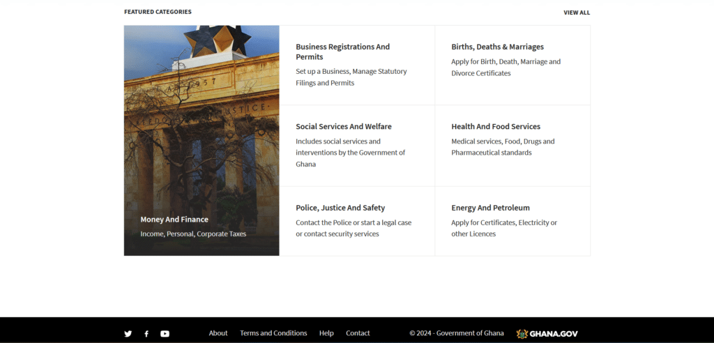
The Government of Ghana has managed to simplify what topics are important to their citizens and arranged them thoughtfully without overpopulating the homepage with too much content. Instead of being uncertain what to do when you land on their page, you have a helpful search bar and some popular categories others are also looking into.
It is a homepage like this that encourages us to read on and learn more about what the website is sharing. When bombarded with too much information, it can become discouraging and we often jump to other sources instead.
The White House

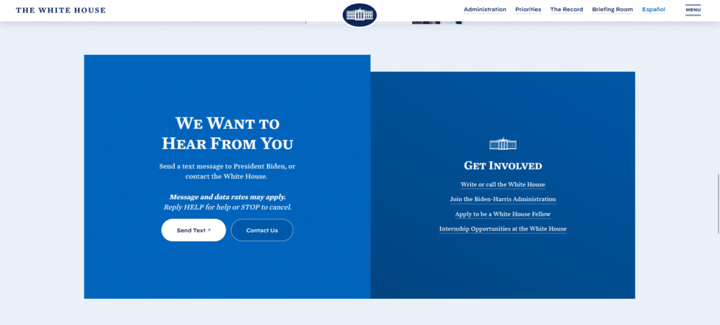
Being the symbol of the presidency, the White House official website becomes the government’s digital voice. With so much going on in daily affairs, it is not surprising that The White House homepage will be full of information.
However, what I appreciate with this homepage is that they have used helpful formatting (headings, subheadings, font sizes) that allow us to skim the information quickly. Not only are they listing out important content, they have also made their engagement sections very easy to use so you actually feel like the homepage is providing you an opportunity to communicate. (Don’t we wish all government offices did that?)
IRS
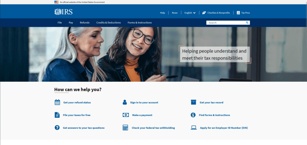
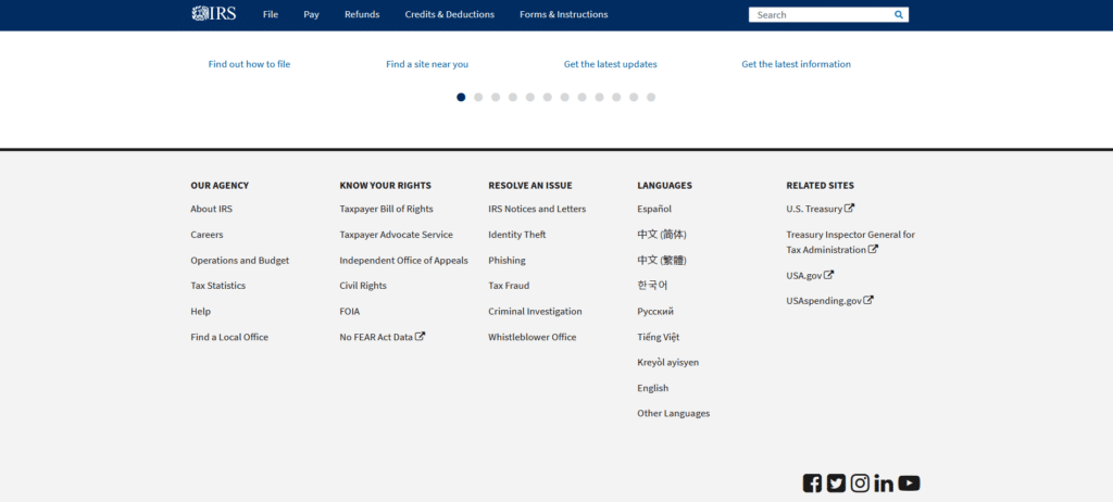
You can love them or hate them, but the IRS has figured out how to make their homepage less intimidating to those who want to file their taxes. We already know how stressful and overwhelming it is when you do your taxes. Having a homepage that isn’t adding to the stress is a relief.
The keyword is helpful. This homepage clearly shows interest in providing useful information to taxpayers instead of bombarding all the do’s and don’ts of tax filing. Because of homepages like this, citizens won’t have an excuse about not having the right information to do their duty.
Data.gov
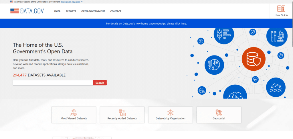
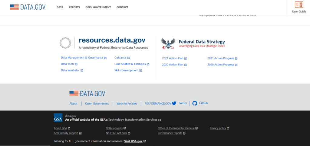
What’s important about data is not always about how much you have of it, it’s also about how well you use it. Data is useless unless utilized well. If your homepage is all about data, how do you provide the reader a guided journey through your website’s information?
Data.gov figured it out by redesigning their homepage to provide creative visuals and helpful links that lead you to the right information you might be searching for. This is an example of what good governance is, you need to keep up with changes in technology for the benefit of your citizens.
myGov by the Australian Government
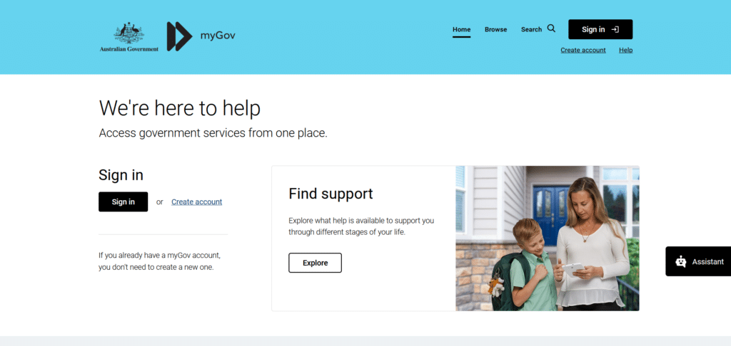
The Australian government has adapted to modern practices of the websites of today by adding a special chat section that floats over their homepage. In our guide: Xtreme Homepage Makeover we make mention of this in Tip no. 14, integrating a live chat will help users who are looking for more information apart from what they see on the homepage.
Having a live chat is more helpful than bombarding the reader with a whole lot of information for them to read one by one. True their promise of “We’re here to help”, myGov provides useful call-to-action buttons so you’re not just reading summary info but also led to the right channels where you might find what yo are looking for.
California DMV
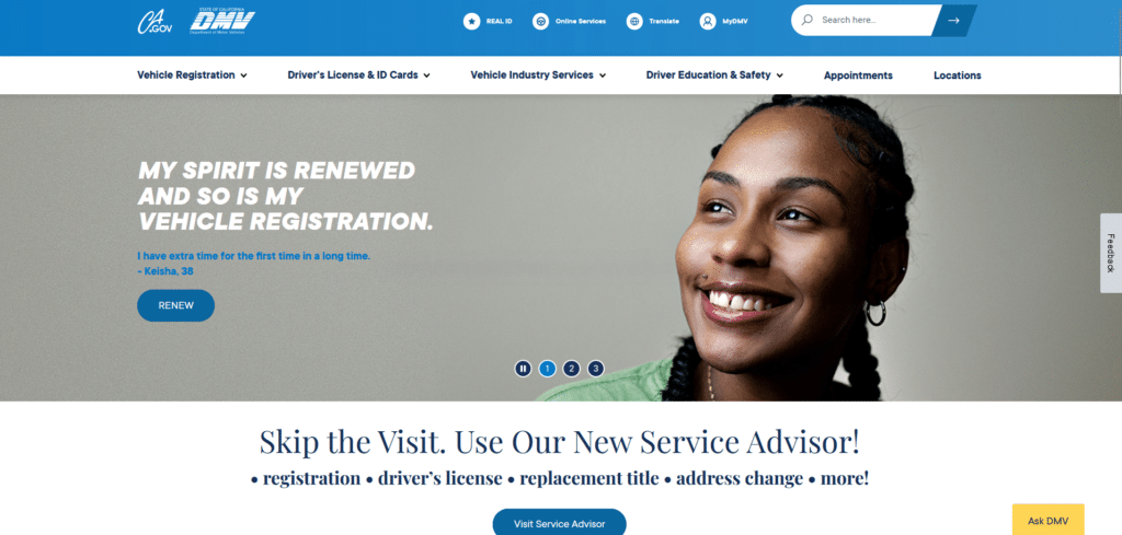
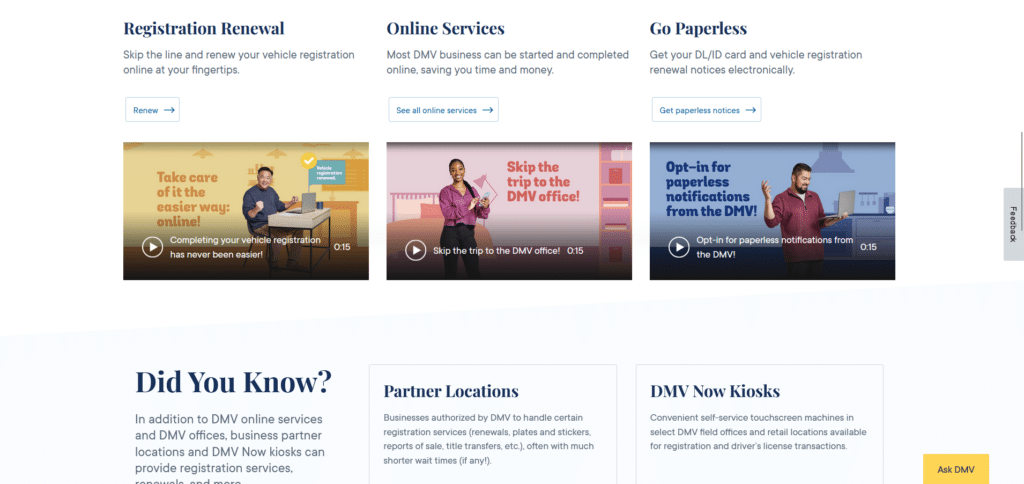
The DMV has gotten a bad reputation for generally being slow and inefficient. It was much to our surprise that this isn’t true at all for their homepage (at least for the state of California). Every section of their homepage clearly wants to provide help and direction to the right channels.
Just like the previous example, they too have a convenient chat/virtual assistant that you can access for more information, almost like having a digital receptionist always ready.
You Can Still Be Informational Without Being Too Much
I remember my visit to a government office to get my first driver’s license. With so much going on, and too many departments to look for, I wasn’t really sure what my first step should be. The only thing that helped me was this big diagram that enumerated what I needed to do and where I need to go.
Homepages with good design are similar to that helpful diagram. It contained all the vital information that would help me in my registration journey. That is what made these government homepages valuable, they were helpful and comprehensive. Design with the reader in mind, and it won’t be too difficult to arrange your own homepage so that it would helpful.


