5 Logistics Company Homepages That Make You Scared of Losing Your Package
Uncover the crucial homepage design errors logistics services must avoid to maintain client trust and ensure a positive online experience.
When it comes to delivery services, there’s a certain level of trust you need to have on the service provider you have chosen. Imagine a situation where you go to their office and everything looks messy, disorganized and you don’t know who to talk to that can help you there. That is similar to how it would be like when you see a homepage that is poorly designed.
These 5 examples will highlight things you DON’T do to your homepage so that you will avoid losing that trust from the very first moment a potential new client will see you online. From confusing navigation to outdated designs, these homepages are a stark reminder of how crucial first impressions are in the journey of choosing a logistics partner who holds the fate of your shipments in their hands.
Biologistics

The design looks rather outdated but they somehow got the initial part of the homepage almost right. It has important links to specific pages but when you scroll down then you can see where it goes wrong. Content in tiny font sizes and all cramped into one section of the homepage.
It doesn’t help as well that when the homepage is opened on a mobile browser, all that potentially helpful info disappear and the homepage becomes a link directory with a contact form. The block outdated design becomes more apparent in the mobile browser. With more than half of everyone’s web experience being on the phone, mobile design should never be 2nd priority.
Total Logistics

Perhaps they can reason out that this homepage is simply a transit page for each of their company homepages. However, I’d like to point out that for their brand, THIS is the first page ANY customer searching for their brand on Google. What first impression would they like to project?
This feels to me like a missed opportunity. There could have been a better way to share information, provide a compelling offer for each company, or even just a small section introducing what they do as a company. (okay they do have that in a form of long text which I don’t wanna read).
Make your homepage engaging. Don’t treat it like some page directory or static digital brochure.
Maple Logistics Solutions


Another case of almost there but not yet, this homepage had a lot of potential because of good implementation of certain elements that we cover on the Xtreme homepage makeover guide. You can see the call to action, convenient contact form, interesting information through vital numbers.
However, the excessively long text just takes so much space and discourages the reader from exploring further. It’s like if you’re listening to a conversation, you want to know the highlights and not the long boring details. Take those long text and simplify them, format the text, and use helpful images/icons.
Freight Forwarder Services
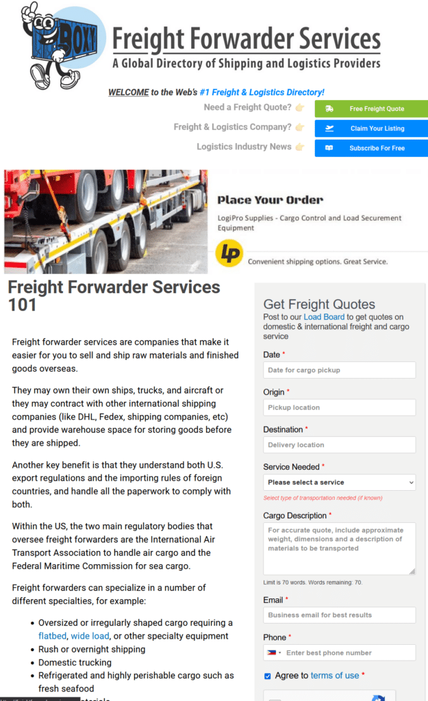

I acknowledge that this is in fact, not a logistics company but still relating to the industry. I handpicked this one because it’s a good example of a bad example. Text overloading, the information all over the place so your eyes don’t know where to look first. The logo is oversized, the design is outdated, and it just feels too much.
A good logistics directory would have provided a search bar FIRST. Those helpful call to action buttons would be more engaging if the text did not overwhelm the reader first. Placing the Freight Quote form in its own section would also be better. Compress and simplify, if you read this homepage on the phone it would be a scroll-fest before you get to anything helpful.
PCSmyPOV
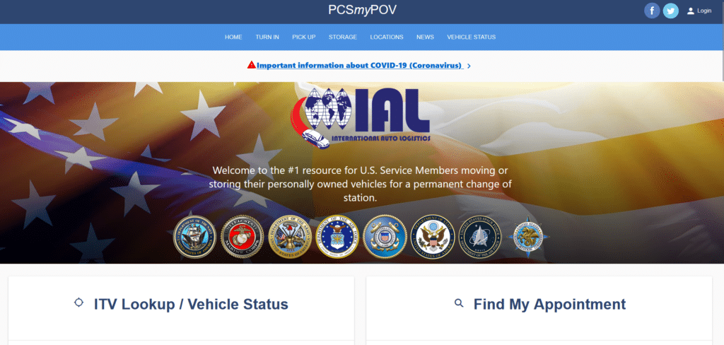
Now this homepage, I understand they kind of designed with the mobile experience in mind. However, it still lacks in content optimization. They’ve got the important links all over the place and if I was in the US Government service, I would get frustrated with having to scroll back and forth to look for what I need.
The important notice could have been made into content blocks that link to another page instead of filling up so much text. News and Advisories could have been compressed as well. Overall the design is outdated. For a government servicing homepage, it really needs updating.
Design With Efficiency As Your Vision, Your Clients As Your Mission
From outdated designs to overwhelming text, these examples serve as cautionary tales of how not to welcome potential clients. A homepage should be a clear, inviting path that leads visitors effortlessly to the information they seek, reassuring them that their precious cargo is in capable hands.
Remember, in the logistics industry, where the competition is fierce and the stakes are high, your homepage is not just a digital front door—it’s the first step in a journey of trust and reliability.