5 Pest Control Company Homepages That Exterminate Their Chances of Getting New Clients
Avoid common pitfalls in pest control website design with insights on optimizing for engagement, mobile responsiveness, and clear information.
Pest extermination is a professional service that require an expertise beyond a DIY solution. If you’re looking for an exterminator you want to find on their website, basic information like contact details, how they work, promotions, and offers.
Dealing with an unwanted resident in your home is already stressful as it is and having to deal with a cluttered and confusing website would only add to that stress. Here are 5 homepages that unfortunately need extermination of some bad design practices.
Johnsons Pest Control
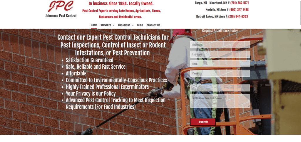
Picture this, you’re on a mission to find a company that can help you with your pest problem. You land on this homepage thinking you’d find out what this company does. THEN you are presented with all this text you have to read through just to know about them!
The extra effort of your potential clients could be minimized by arranging your information in a clean, engaging way so they don’t get even more stressed having to deal with some much words to read. It doesn’t help either that this homepage isn’t mobile responsive.
When you read their page on a smaller screen, the whole site gets cropped and that will add more work on the reader’s part just to read your content!
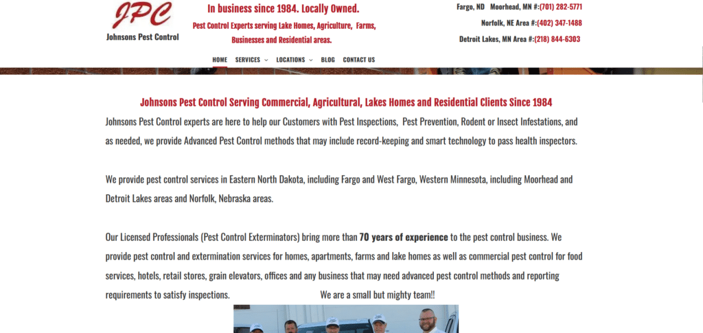
Detroit Wildlife Removal

Just when you thought the first example was bad, check out this homepage. I’d like to remind all companies that your website homepage IS NOT YOUR BLOG. It’s such a wasted opportunity because this homepage wasn’t too bad above the fold.
It was when I scrolled down that I saw the huge problem of making their homepage like a blog article. I get it that they’re trying to be helpful by providing some educational information. But people have short attention spans online. You have to inform in a entertaining and educational way that makes them give your content a chance.
A-1 Pest Control
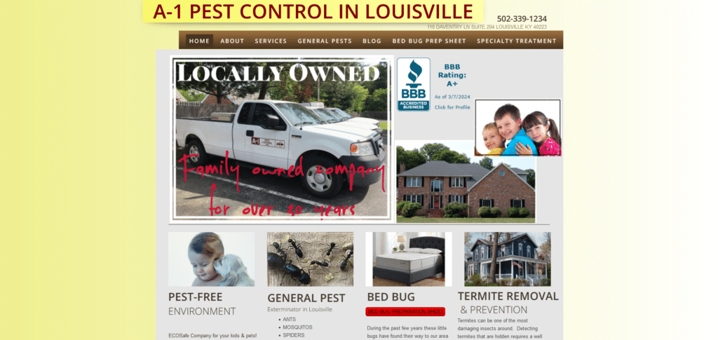
I don’t even have to describe this homepage for anyone to get why this design is NOT IT. Look at how everything is everywhere all at once. It gets even worse as you try to browse it on your phone. The cropped effect and hard to read info is such a turn off.
They did get some elements right like the easy to find contact number. Our Xtreme Homepage Makeover Guide talks more about good design practices like this. We also talk about how company brand logos/names shouldn’t be oversized like this one!
Guisborough Pest Control Services
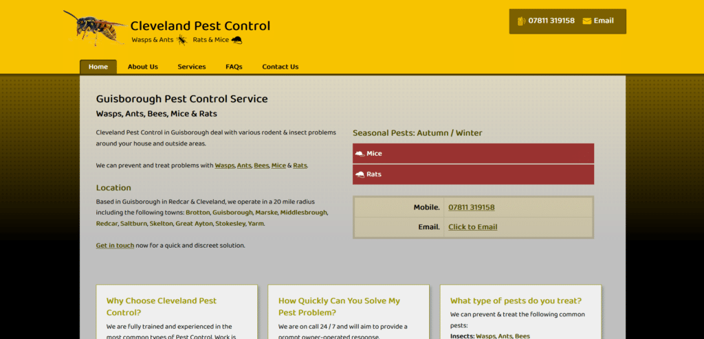
Before I point out the bad points, it’s worth noting that they are quite optimized for speed as the page loaded really quickly. Then again, the lack of images is what made it load quickly. Because of this text-prioritization, the speed improved but the creativity suffered.
If a client has no choice sure, they would skip the creatives and just contact this page. But if you’ve got competition, what can you show in your homepage that would make you the better choice? Where’s the customer reviews? Where are the images to make readers stay longer on your page for browsing?
If your homepage is rather bare, you can bet that people don’t stay long to learn more about your company.
Rose Pest Solutions
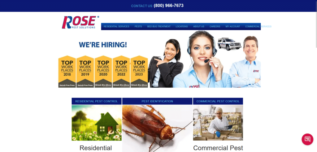
You see this is why choice of images is important when designing your homepage. When I first looked at this page I immediately though real estate agency or call center company. You don’t waste your homepage’s above the fold by placing content that doesn’t directly relate to what your company does.
If you wanted to offer career opportunities that can be placed discretely somewhere below in the homepage. Their homepage missed out on opportunity to give promotional offers, free estimate call to action, and even customer reviews.
Exterminate The Pests On Your Homepage
I know I might sound rather harsh when talking about homepage design. There’s a sense of urgency when it comes to taking care of your digital real estate because this is where clients will get the first impression of your company.
The thing is, it’s not even that difficult to really get the design right. Take a look at these 5 Pest Control Homepages that did it right. They knew what clients are looking for and they made their homepage helpful and relevant.
Something as basic as a homepage renovation can significantly improve your reader to client conversion if you already are ranking for your locality in search engines.