5 Travel Company Homepages That Make You Want To Stay Home Instead
Learn what not to do in travel agency homepage design to build trust and credibility, avoiding common mistakes that turn potential customers away.
Aside from being a very competitive industry, everyone has major expectations when it comes to travel. While the promise of a dreamy vacation that takes the stress of your overburdened shoulders is the goal, not every travel company is able to give that sense of reassurance early on.
Having a bad homepage as a travel agency is not necessarily a tell-tale sign of a bad company. But if a brand isn’t particular about the small details about their own website, how can they be trusted in the more sensitive matters such as a guest’s travel arrangements?
If you want to build a sense of trust for your potential customers, you will need to avoid what these 5 homepages are doing.
Midwest Travel Solutions
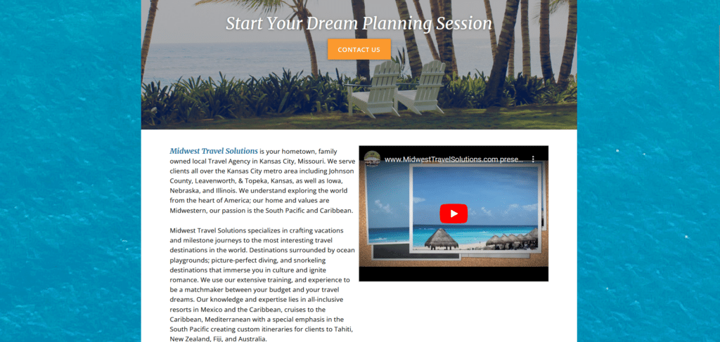
To start with, this homepage is not exactly bad. It does some good practices such as having their contact number very visible and easy to find. Even information in the homepage is not too difficult to read through. It may have fallen short in having a lengthy explanation of their company’s identity.
The lazily embedded youtube video is not exactly helpful either. You can tell because the video has less than 200 views and it was uploaded 7 years ago. This is why it’s important, that if you’re selling a vacation, your homepage has to encourage the idea of a vacation! Don’t miss out on laying out the dream on the homepage so that it generates feelings of excitement!
Quite frankly, this website needs an Xtreme Homepage Makeover so it will look like it’s keeping up with the Digital Upgrades of 2024.
Travellers Inc
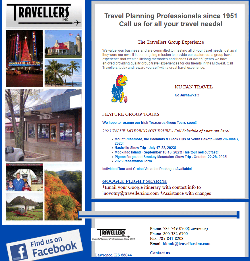
These professionals have been doing travel planning since 1951! Sad to say their website kind of feels like it was also built in 1951. (Come on, let me have this one, I know websites started in 1991) For a company that has been around this long, it’s missing out on the tons of Google reviews their past customers have of their awesome services.
If you are a service-based company homepage, NEVER miss out the chance to showcase what good things your customers have been saying about you. This is important for building trust especially if you have new visitors on your website who have never heard of you before.
Global Travel Agency Online
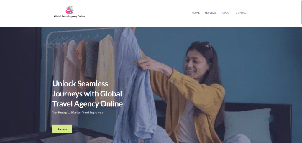
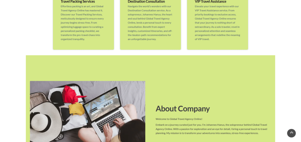
Ambiguity is the death of clear communication. If a homepage lacks in specifics and is merely filled with content to simply act like placeholders, then you will fail in communicating anything of value to potential customers. To be fair though, I think this travel company isn’t a legitimate one.
Providing information such as an address, contact number, or even testimonials from your previous customers may give your brand an image of legitimacy. No matter how “fancy” your homepage design is, if you don’t have substance, it will not fare well in the world wide web.
TravelAgents.com
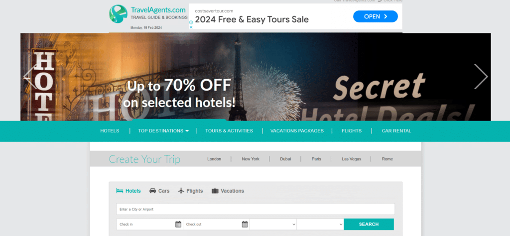
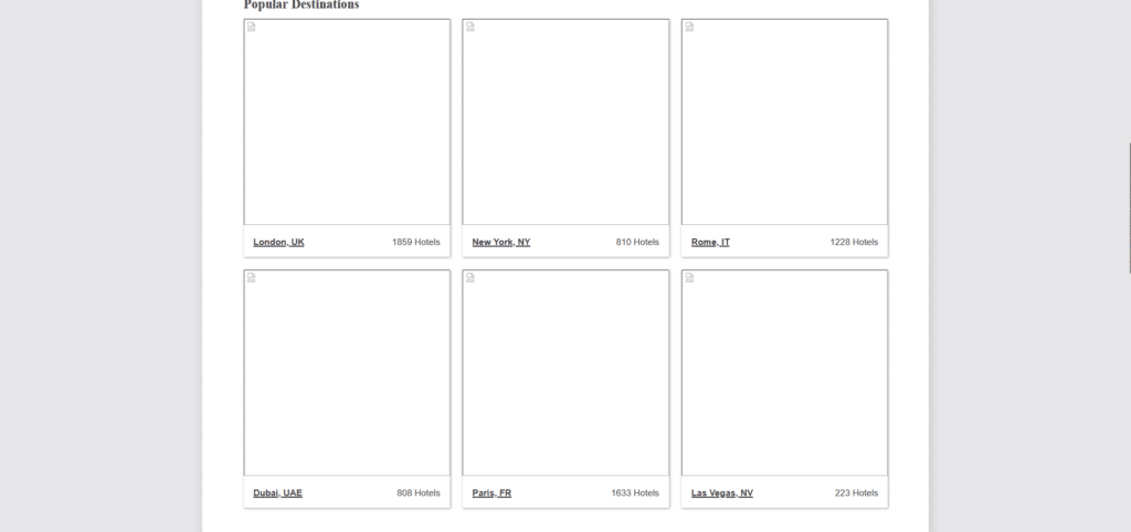
This homepage is like a vehicle that takes you to your destination but never really makes it there. It knows the direction it’s supposed to take as you can see some key elements like a search option for travel packages. Links and information are not too bad in organization either.
But just when you think all is well, you’re met with broken image placeholders, a 3rd party ad that is irrelevant to this company, and really no really way to verify if this company is legitimate or not. Sure some might browse around for destinations, but when they’re ready to book, there’s no way that they will feel safe about this website.
Dream Travel
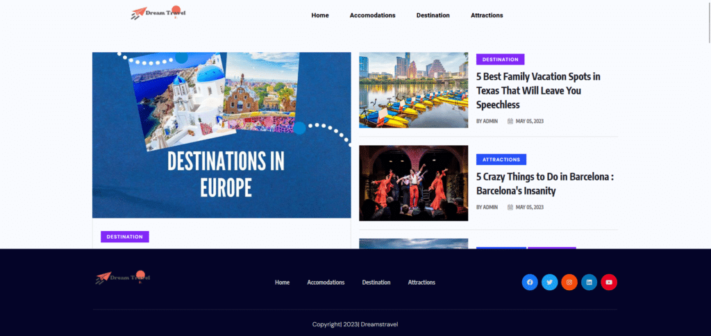
Again, probably not a legitimate company but still a good example (of a bad example?) of what NOT to do with your home. Do NOT treat your homepage as a blog post repository. There’s a space specifically for that and it shouldn’t be your homepage.
Make sure that your logo and your domain name match. Having irregularities with your domain name as well as brand image, might breed some sense of distrust. Use your digital real estate EFFECTIVELY. This one shows a footer section that consumes 25% of the screen space. What’s even worse is that it follows you all throughout the homepage!
Building Trust Starts With Good First Impressions
When you’re trying to convince someone to spend their hard-earned money with your services, it is vital that you give them the feeling that they can trust you. Travel and tourism is an industry full of scams and frauds. People want to feel relaxed and excited instead of uncertain and anxious.
What you communicate on your homepage, could be the major difference between a guest who is eager to book with you or a guest who’s just immediately decides not to go with your company. Key elements in a successful homepage can make or break your business. Thankfully these are not too difficult to implement to your own website. Read more: 12 Website updates That Can Make your business Grow!
Get started with your own developments and see your phone begin to ring more times in the day than you can handle!


