5 Best Examples of Car Company Homepages That Will Make You Want to Buy a Car
Discover car company websites excelling in responsive design and user engagement, a perfect guide for enhancing your own site.
Embark on a digital journey that might just lead you to your next dream car (or car rental). We’ve collated some of the best car company websites that really implement the best practices for web design that we follow in our Supercharge Your Local Website guide.
These websites aren’t just about showcasing cars but are also about adding value to readers who want to learn more. Whether it’s searching for quotations on car rental or brand new car purchases, or even just learning about specifications and other important information; these homepages are creatively done to give the reader a smooth experience that may just make it easier for them to close the deal.
Maruti Suzuki
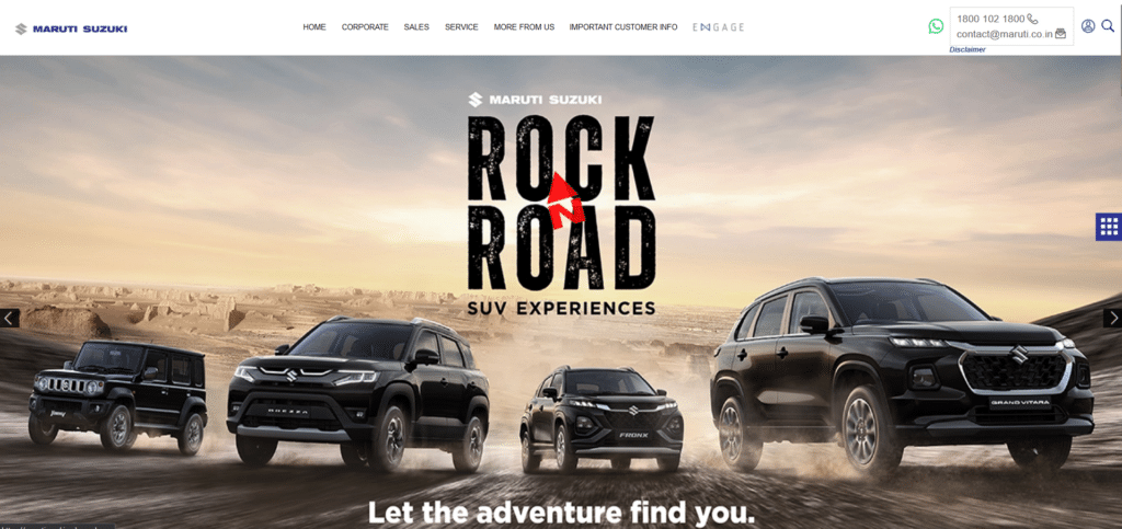
Almost like a digital car showroom, Maruti Suzuki creatively uses beautiful copy that isn’t about saying so many things to get a message across. While we can gloss on about their awesome above the fold photo, you can see that there’s less focus on trying to push too much information and more of making key information that gets people reaching out, easy to access.
However, there’s still that desire to present more information a customer might need. They’ve cleverly hidden in a small square box that can pop-up as a website menu for other important pages.
Copart
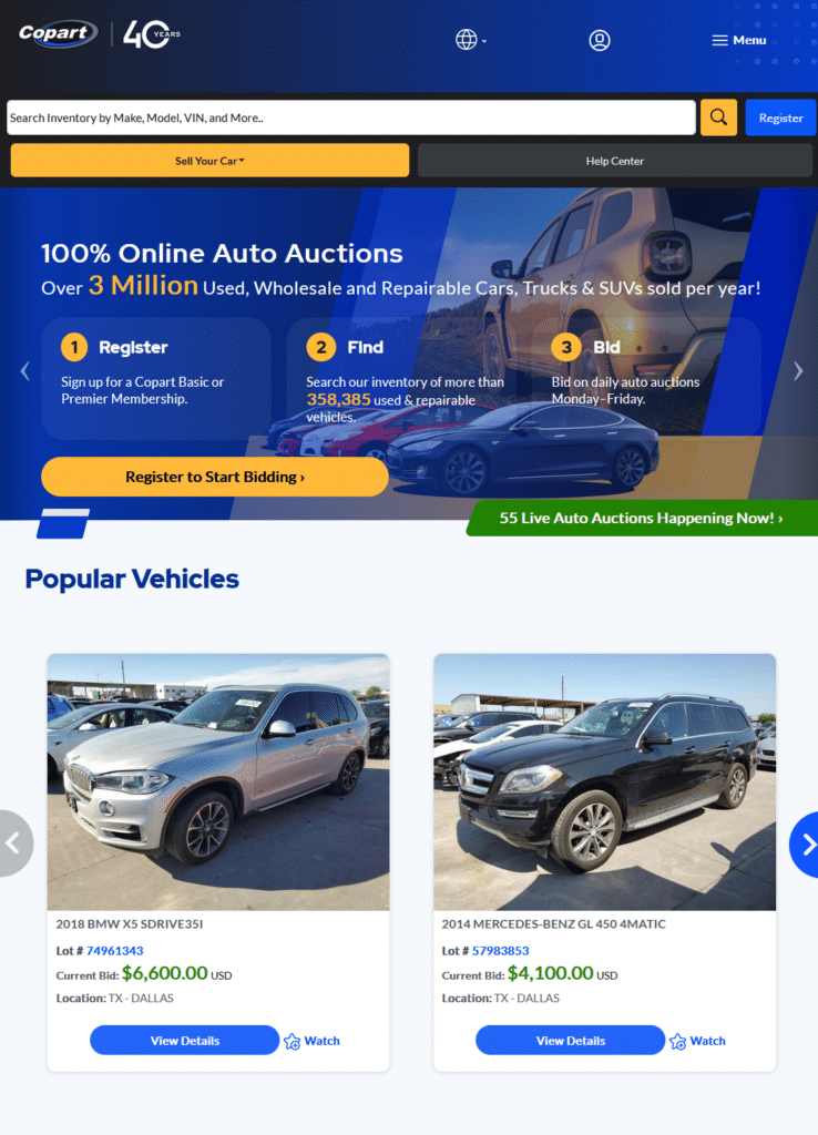
Functioning like a niche search engine for car parts and used cars, Copart effectively communicates important call to actions. Whether it is to “sell a car” or to search for other car models, it’s a very clean experience that won’t have the reader fumbling around information that they don’t necessarily need.
Nothing too fancy too, it focuses on communicating clearly rather than trying to impress and that’s what makes a lot of good car websites very effective.
Kia

Even with the temptation to use the homepage as a full showroom of all their line of vehicles, Kia optimized the first look experience on their website. They know that overwhelming a visitor will actually make the reader bounce out of the homepage due to impatience or frustration.
One of the most important things they did aside from this clean and on-brand design, is to optimize for mobile. From desktop to mobile, the website does a very seamless transition with their responsive web design.
Tesla
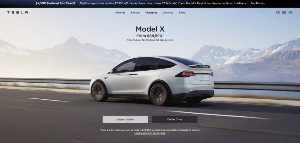
Tesla as a brand receives a lot of love and hate but one can’t argue with how beautifully they’ve designed their homepage. Taking advantage of a focus banner on top, they can still do sales without destroying the homepage’s design.
There’s this misconception that you shouldn’t be too “sales-y” when doing your homepage when what it should really mean is “you shouldn’t be incorrectly putting promos on your website”. Provide the important details that are needed like the link to the shop, or call to action buttons such as “Demo Drive” but don’t be too strict that you miss out on promotional banners strategically placed on the homepage.
Carsales
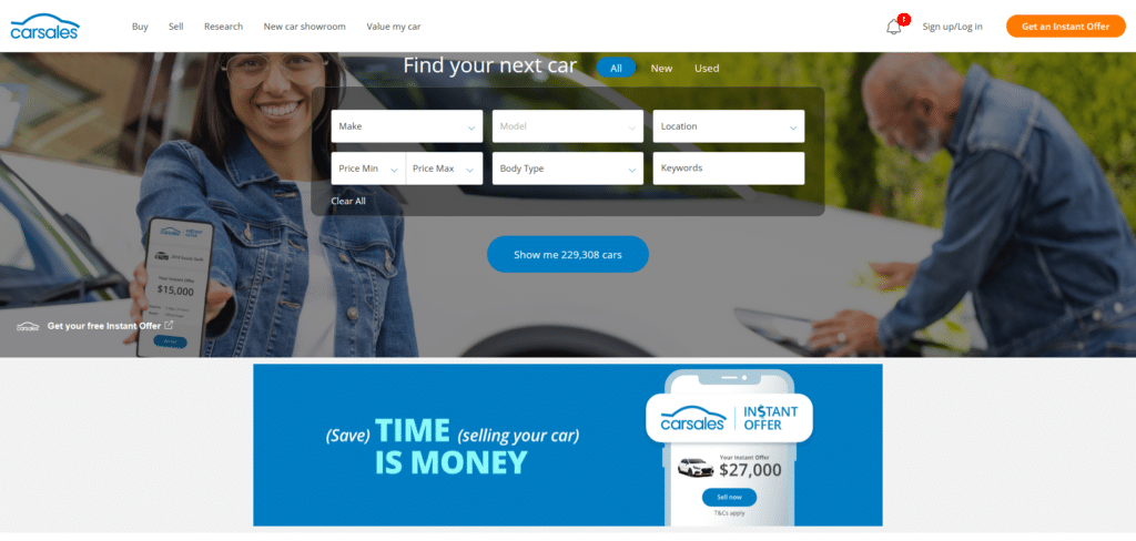
Now here’s another car company that has resisted the temptation of oversharing information. They still got a nicely balanced banner underneath the most important thing they have to offer: their Car sales search fields. Immediately as you land on this homepage you know EXACTLY what this website has to offer and the creative banner pushes that message as well.
Scrolling down you can see them immediately providing an “Instant Offer” message that has a very convincing copy of why you need to sell your car. Your homepage is always an opportunity for a good impression and if you’re selling cars, a crazy good offer you cannot miss out on, is definitely effective in doing so.
Responsive and Communicative
If you look at all 5 car company websites, you will see how they all have the common features of responsiveness and friendly communication. They don’t feel like they’re shouting too many things and instead they feel approachable and helpful.
Their homepage best practices are not even doing anything extremely complicated, in fact, YOU can do it to your own website without having to do a completely website rebuild. If you’re interested how to get your website working as effective as theirs, then set a free consultation schedule with us to learn more.


