Top 5 Restaurant Homepages That Will Have You Booking in Seconds!
Learn the secrets of the web's most captivating restaurant homepages.
Food and beverage as an industry can be challenging when it comes to communicating to website visitors. Should I focus on the brand? Should I focus on a dish? How do I effectively offer value to website visitors so that they can become our customers?
For restaurants with multiple branches there’s also that consideration to make. So what makes these restaurants in this list, our best choice of examples? They knew how to balance artistry, functionality and value-offering to website visitors. Find out more of why they are the cream of the crop when it comes to homepages for restaurants.
Federalist Pig
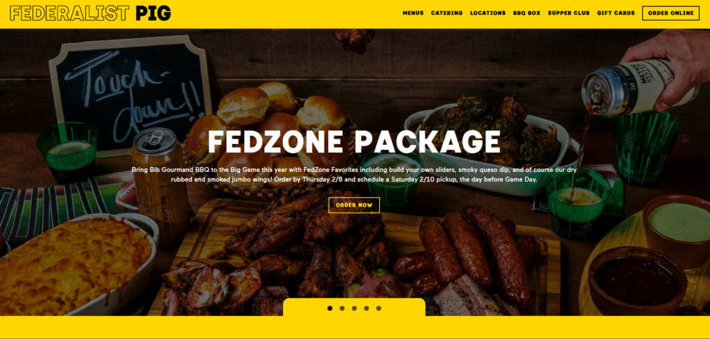
Striking brand colors and tempting offerings, Federalist Pig knows how to get a reader ordering. This is what restaurant websites should be doing: instead of loudly broadcasting “look at me” they should be actively saying “want something awesome? Click here!”
The nice blend of black and yellow colors work in making the text easy to read.
Judging by the other pages I think this restaurant will have more branches in the future but if we were to fix anything about this for now, it would be nice to have a contact number just at the top for easy contact information access.
Lily’s
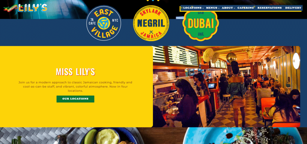
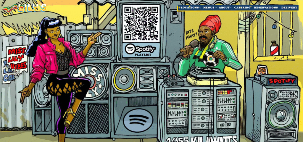
Lily’s is an example of a restaurant brand with multiple locations. Neatly arranging their links for important information, Lily’s already knows what customers are looking for.
What makes them strikingly interesting is how they’ve deviated from the basic rule of being too minimalist. They know their identity and went with it without overdoing it.
It’s a maximalist approach in design while still maintaining a good flow. They deserve to be in this list. If there’s one thing I probably would add, is an offer section like a promotion or a discount voucher.
Via Real

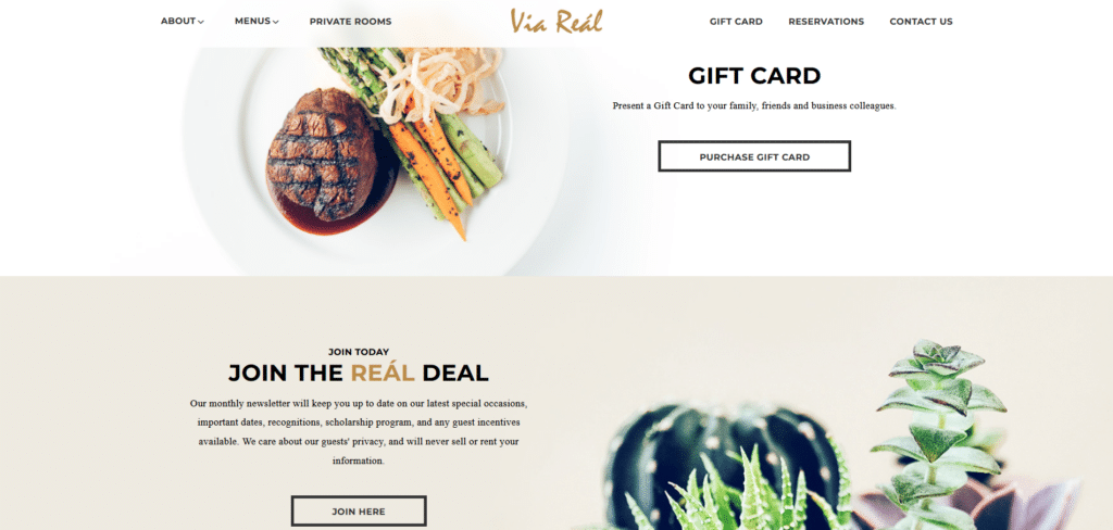
Here’s a homepage design that reflects the class of a certain restaurant. They know how to keep messaging simple and they did one thing that always catches my eye when I’m going through different websites: lovely use of call to actions!
Instead of just using the website as some sort of online billboard for their operating schedules and contact information, they take advantage of the opportunity to communicate some value offering. Even above the fold they already have some early promotion for Valentine’s, their marketing team knows what’s up.
Talk about keeping it easy for customers to reach them, their contact number is in a larger size font and just underneath it, “Book A Table”. Brilliant.
Jollibee USA
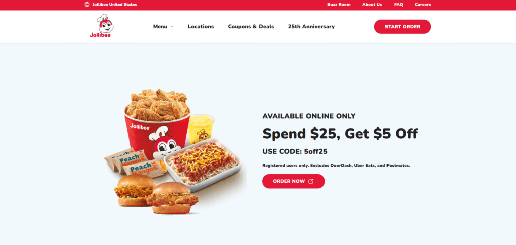
If you’re active in Social Media, it is more than likely you’ve encountered this fast growing fast food chain that originated from the Philippines. For a company that does a lot of advertising both online and offline, they have made it their mission to make sure their website does not miss out on every opportunity to convert their readers into loyal customers.
The first thing you see is an exclusive offer that will pique one’s curiosity of visitors who have not yet tried Jollibee. Having something to take the readers from being just casual visitors to actually buying something, is effective.
Especially if you’re a new brand trying to make its way in the market you got to offer something that will let visitors give you a try.
Who knows, they might keep coming back for more.
Din Tai Fung
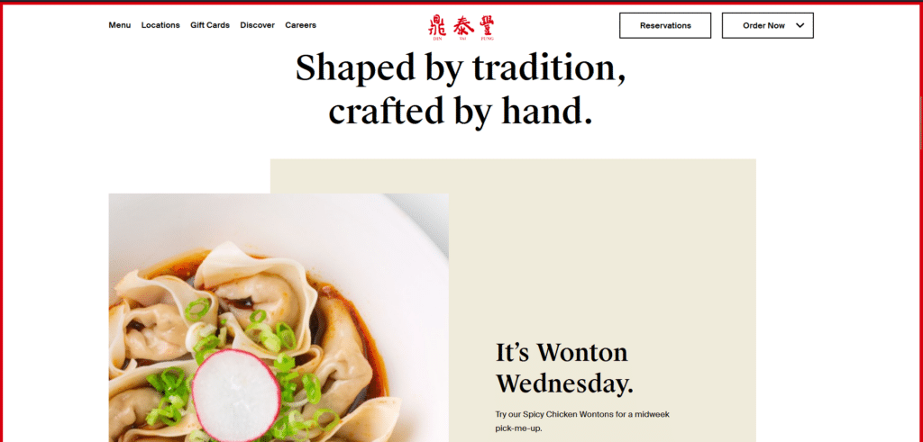
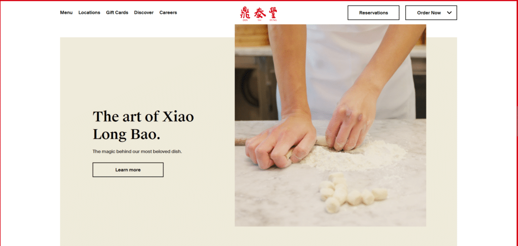
You really don’t need to say a lot to say much. What I mean by this is that it is all about creatively communicating your brand and service offering without using so much text that you know a new visitor will probably just skip. This is a very bad practice that I have seen in several restaurant homepages.
This is why Din Tai Fung makes it to this list of examples because they show homepages need to be done: lesser text and more effective communication with clear call to action buttons.
The buttons are nicely contrasted from the rest of the website’s content so your eyes go to them without them being glaringly conspicuous.
Clean, simple, refined and effective, Din Tai Fung is truly a good example.
Good Restaurants Offer Value
Key takeaway from these examples. As a restaurant you need to take advantage of your homepage as a venue where people get their first impression of you. Sometimes it’s not just about giving a fancy first look at what you have to offer but also giving visitors an opportunity to try you out.
By offering a tempting promotion you can take the first step of letting them try you and in the food industry, this is very important. You know your food is good, you know your restaurant can offer a wonderful experience but you got to give visitors a reason to give you a chance.
It is also important to remember that these visitors are possibly hungry and already decided to go to your restaurant. Make sure you make it easy for them to make a reservation or contact you through effective use of call to action buttons.