5 Bank Homepages That Make You Hold On To Your Money Instead of Depositing
Check out these bad examples of bank homepage designs that are either stuck in the past or just not providing a good user experience.
Imagine having to decide which bank you will put your money in and you’re going online to check what banks are available within your area. Would you trust a website that feels like it was last updated pre-pandemic era? The digital age is here (and has been for sometime) and something as important as banking needs to have websites that listens to user experience.
If your homepage refuses to adapt and develop designs that are made FOR the people, then they are sure to miss out on potential new accounts. We’re pointing out elements and points in these 5 homepages where they missed out on so that you can learn what makes a bank homepage effective.
North Alabama Bank
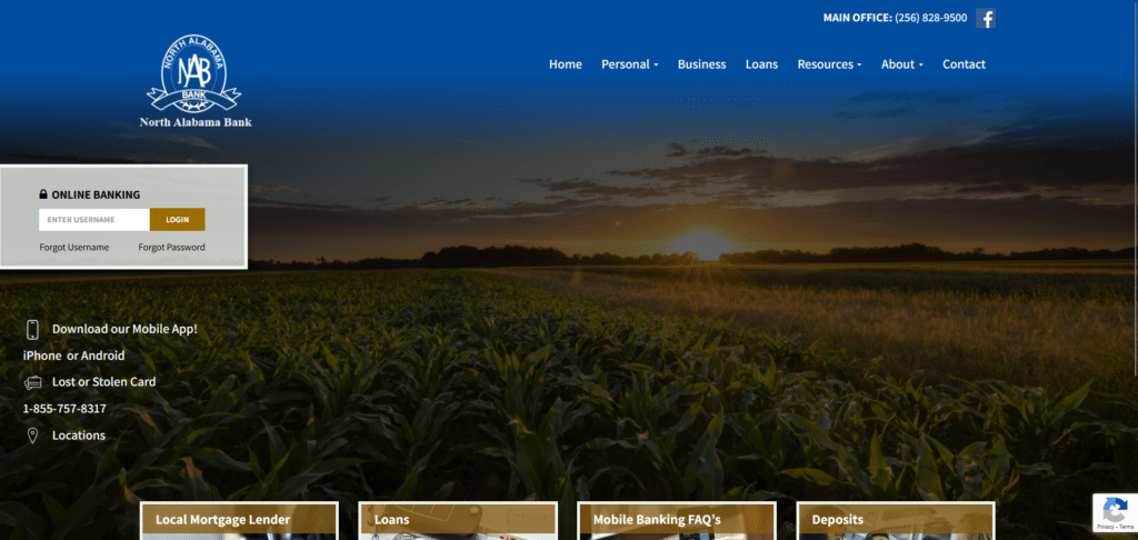
Even if they did follow some important elements like easy to find contact number and making sure their homepage isn’t overwhelming, it has also taken the extreme opposite direction of being underwhelming. What’s the cover photo supposed to do? How does it communicate your services?
The details on the left side are helpful but it would have even more helpful if they lead to pages that gave more details. There’s a call to action for downloading their mobile app but the action word isn’t the clickable link, it’s the mobile OS and they’re not obvious enough as buttons to be clicked on.
Crown Bank
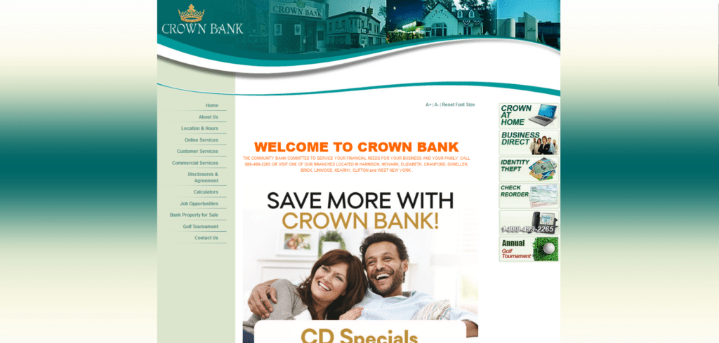
There’s so much to dislike about this homepage design. Aside from using a design that looks like it was born out of the early days of blogging, they break so many rules on giving a good user experience. Above the fold it repeats its brand name 3 times! This almost sounds like a TV commercial from the 90s where they kept repeating the business name.
Another mortal sin in this design is its lack of mobile responsiveness (which further verifies the ancient nature of the homepage design). The font are already very small and painful to read, it gets even more difficult when you’re seeing a cropped out homepage on your mobile device.
While this homepage needs a complete overhaul, we cover some small changes you can do to your website through our Xtreme Homepage Makeover Guide so that you are optimized for better client acquisition.
Stockmens Bank
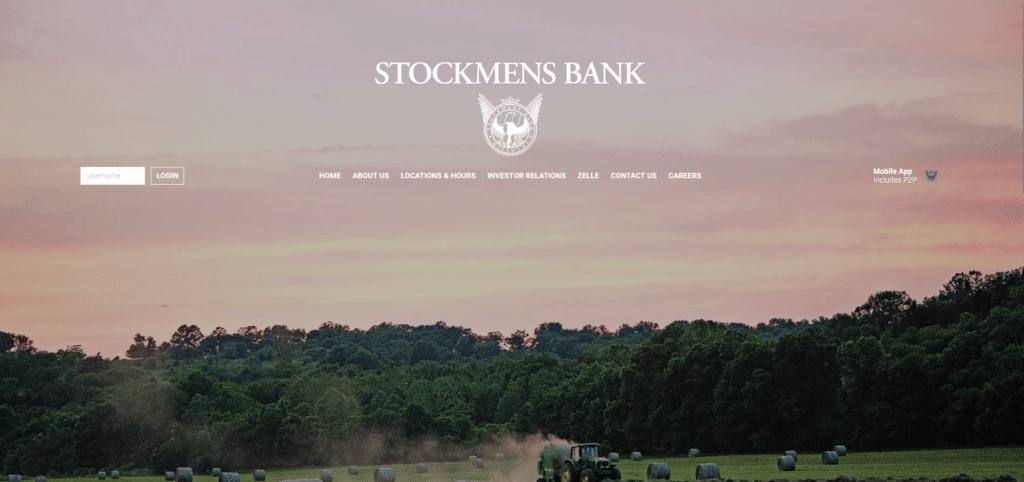
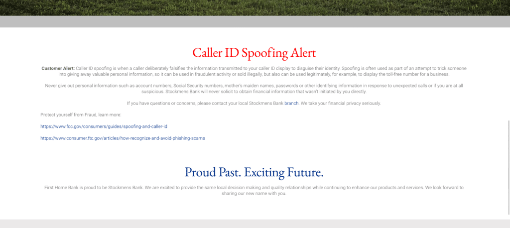
Okay I get it, they’re trying to impress using a beautiful image. But is that it? They could have introduced themselves above the fold and provided a carousel of information about their services. Instead, I see a “mobile app” info on the upper right that isn’t clickable.
They used so much digital real estate for… nothing! Spaces, too much of them! Where are the offers? Contact forms? New account promos? Anything that tells the visitor “hey we’re a legitimate and professional bank!” Looking pretty is not enough, you gotta have value for your readers or else, you’re just another digital brochure.
FirstBank of Nebraska
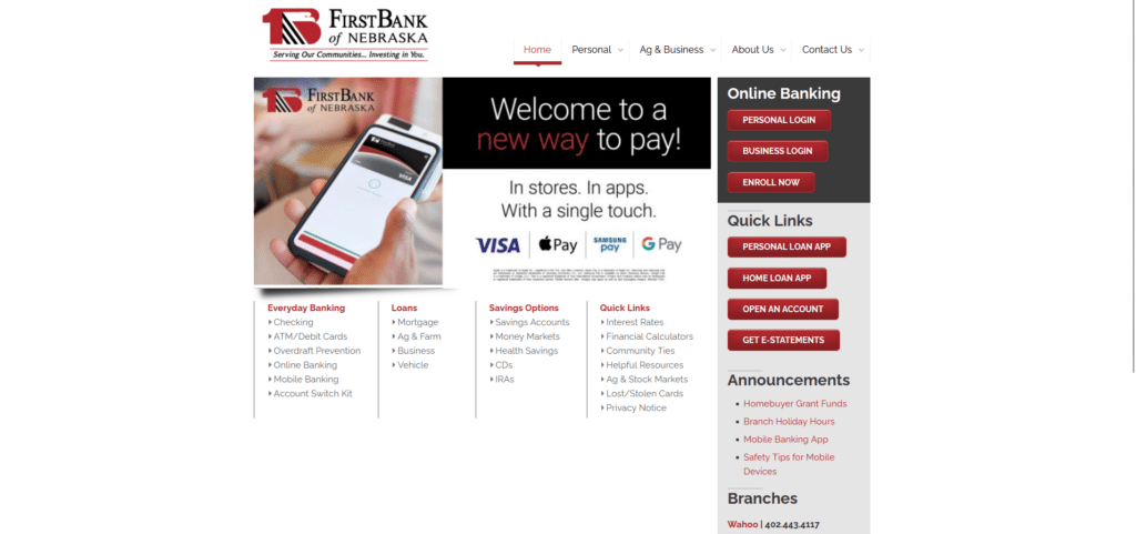
There was a time when this kind of homepage design was generally a good design. You had a homepage that would load faster because it was simple, and it actually had a mobile responsive design too so elements fit right in a smaller screen.
However, this no longer works for the modern web user. There are too many buttons squeezed close to each other, I can’t easily read which services are which and even if it was simple, it doesn’t have that “flow” which modern homepage designs have.
Blue Foundry Bank
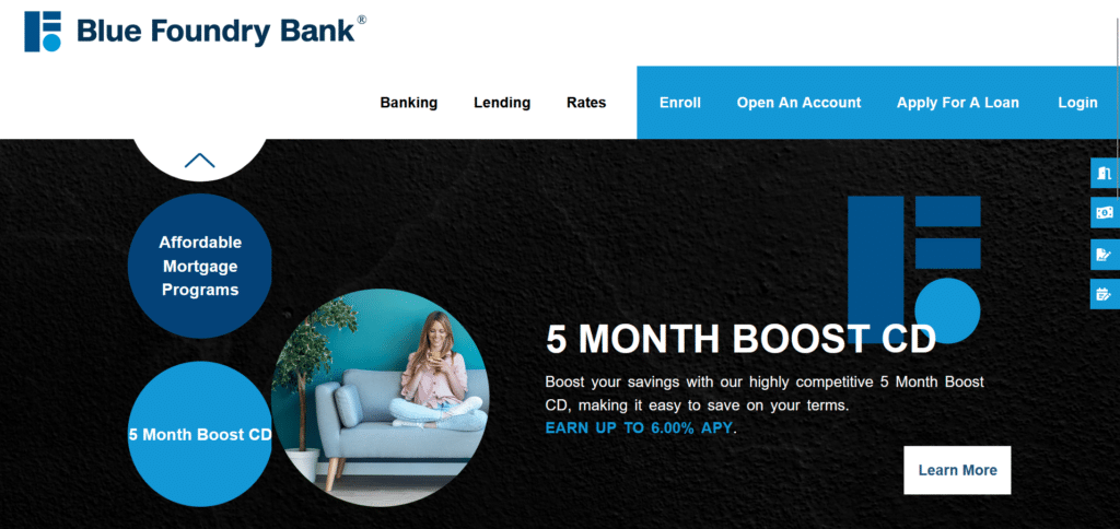
To be honest this homepage is already on its way to looking better. The only thing I would fix here is spreading the information in a more linear way so that it’s not all compressed in one section. This design did make the homepage shorter but it made everything look messy.
In one glance you don’t know where to look or where to start. There’s too much going on and it’s not a very smooth reading experience. I get it, they’re doing this artistic look similar to the logo, but the user experience suffers in the name of art.
The Digital World Is A User Experience-Focused World
If it isn’t already obvious to you, the digital world is dictated by the user experience. There’s always competition for digital presence and if you are lagging behind in creating that smooth digital experience, then your brand will suffer.
Not only do users “reward” the banks for their good homepage design, search engines like Google will also take notice! The longer a user stays on your page, the more likely Google pushes you up in search results. The more people engage, the higher your priority in Google searches.
So give your users a reason to engage, to read, to stay on your homepage by building them a great homepage design.


