5 Fitness Homepages That Make You Think Twice About Going To The Gym
Revolutionize your fitness brand's digital presence with expert insights into creating a winning fitness homepage design.
On the surface, the fitness industry is highly competitive and spells excellence with big bold letters. Everything about a fitness brand revolves around the idea of being the best version of yourself. That means brands will also have to exude that vibe when presenting themselves on the web. Confidence and certainty has to be the impression you give out when you have a homepage.
Because most fitness websites are really doing it right, I will admit it took me a little longer to find examples of Fitness Homepages that are in dire need of coaching so they can be winners of their industry in the digital space. Some of them might have gotten two or three things right for their homepage, but as with fitness, you want a complete approach to really get those results.
ROCovery Fitness
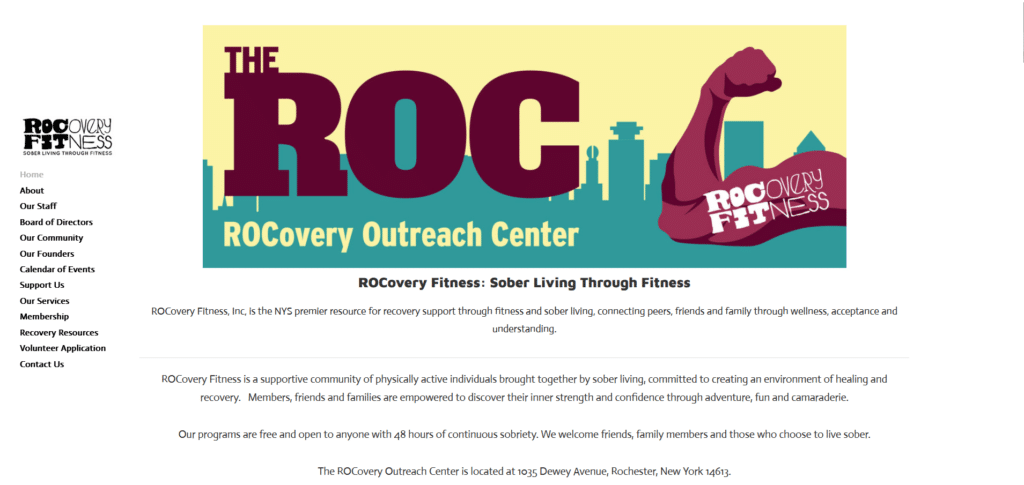
To be honest I feel bad having to call out this homepage because I like what they stand for. The cause is good but the messaging is… challenging. I understand they want to take a more approachable vibe and put it out there. But there’s just one concern: there’s too much going on on their homepage!
The menu bar is loaded with several links that can overwhelm someone new to the site. Above the fold there’s too much copy going on and not really written in a way that allows for easy skimming and absorption. Finally the images are compressed so you won’t be able to read them properly unless you download the image and zoom in.
Advocacy is good, doing something for a cause is great. However, it would build even more confidence in potential members of this fitness group if they can share their details in a way that is good for the eyes and comfortable for the reader.
Fulton County Wellness
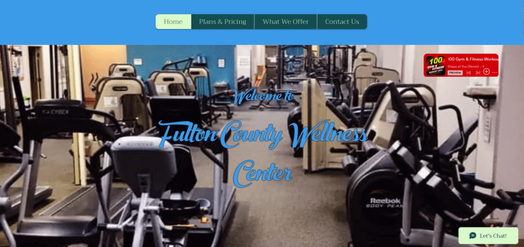
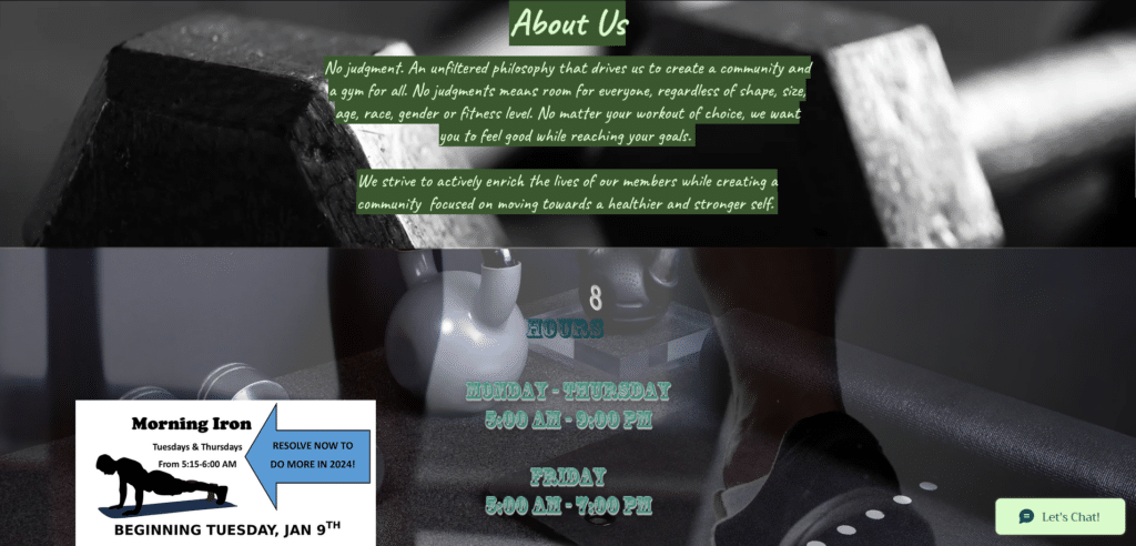
Can you count the number of font types this homepage has? This will hurt the eyes of any proper web designer. But before you start hating on this homepage I want to point out some good things they got right. Their menu bar is clean and direct to the point. A helpful live chat button is also a positive point.
For a fitness homepage you can really see they are trying and they’re actually almost there. They could choose a better website theme for one. Instead of a Home section in the menu option, they could have their brand logo situated at the upper left corner. Font types, keep it 3 max font types, 2 is even better.
Fulton County Wellness, you’re almost there, if you’d like to schedule a call with us if you want your homepage to look like a champ!
Derrimut 24:7 Gym
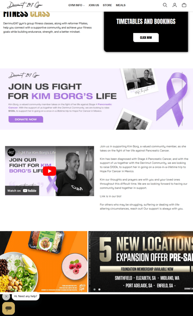
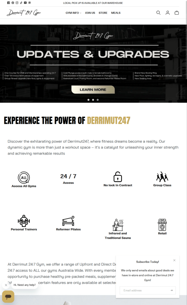
Learn more? Donate Now? Subcribe Today? Which is it? There’s so much going on in the homepage that I’m not sure where my eyes should focus on first. This is what happens if you treat your homepage the same way you treat your gym’s community billboard.
Yes you can do sales, yes you can do promotion, but no you should not overwhelm your visitors! Clean it up and start with a sequence that is easy to read. Instead of a whole section talking about your advocacy, that can be reserved as a button that a visitor can click to read more after reading a small excerpt.
We’re not saying that they should take down everything on this homepage. It’s more of prioritizing which content is important and laying them all out so that it doesn’t get overwhelming for the reader. To be honest, I wasn’t even sure if they were selling equipment or a gym subscription because it was all too much on the homepage.
Fitness Passport
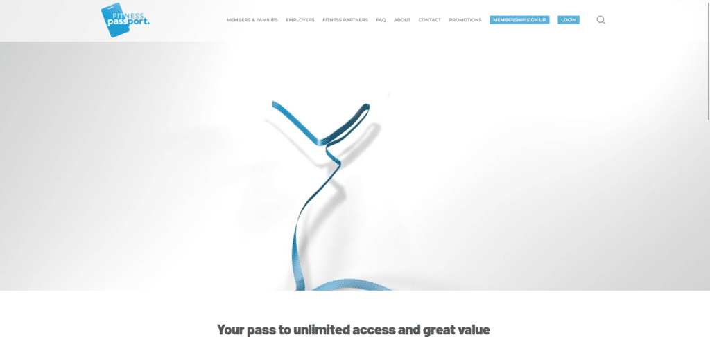
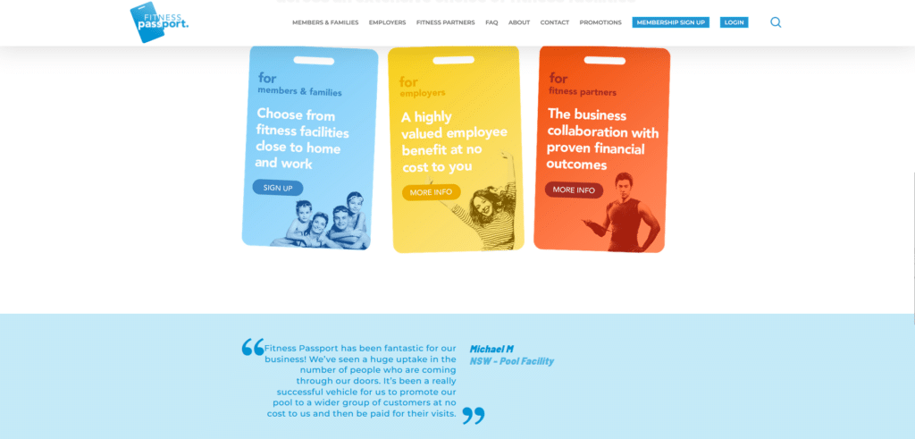
If your homepage cannot inform a first time visitor what is it you do or offer, then that homepage has failed. Without clicking on any of the links to the other pages, I really could not tell what this website was for. Is it a subscription pass service provider? Do they manage passes for gyms?
Apparently it’s a program. There’s so much real estate on their above the fold banner and instead we’re forced to watch some branded animation that doesn’t really tell me anything about what Fitness Passport is/does.
Lesson here is that you must treat your above the fold section of the homepage with utmost importance. Sometimes all it takes is one look at this section before a visitor will decide to close the browser or read on. And no, NEVER excuse your ambiguity by banking on the curiosity of the visitor to read more.
Ladies Fitness & Wellness
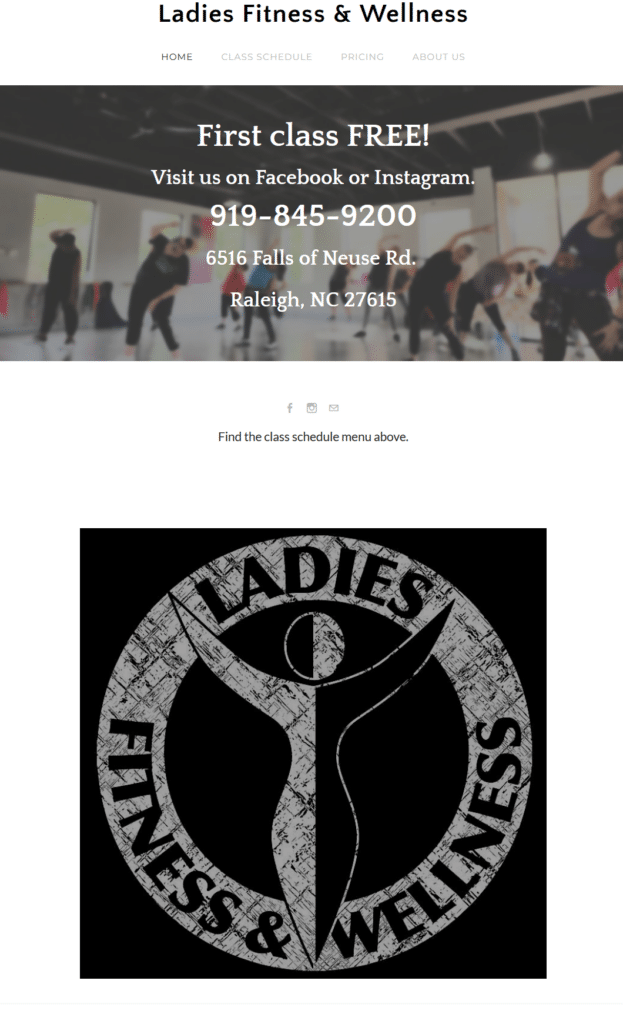
I always appreciate a homepage that is clean and easy to read. However, there’s such thing as too much when it comes to minimizing excessive content. This one almost feels like a brochure hosted on a page. I mean if you really don’t have anything else to post maybe you can use the rest of the homepage for other details.
Why bloat up a huge image of your brand to fill up more than half of the homepage? That could have been digital space for the pricing and the class schedule. Think of your visitors, would they rather spend time staring at your logo or learning about your pricing and class schedules?
Bringing Your Best Foot Forward
Sometimes people think we are too serious when it comes to doing website homepage design. The thing is, it’s only right to be serious when you’re in an industry where competition is king and everyone wants to be on the top of their category! You are in a industry of high performance and results and that means you need to practice what you preach.
In workouts we know that before we start hitting PR’s we first have to start with getting the movements and posture right. The same goes for homepage design. You got to start with the basic things that makes the website visitor’s experience convenient and worthwhile.
Sometimes, to get to the end of the race you need to start making those little steps of progress. Maybe that’s all you need for your homepage. Check out the Xtreme Homepage Makeover Guide to see what those little steps are if you’re not ready to overhaul your entire website.


