5 Construction Homepages That Are So Poorly Designed, You’ll Question Their Building Standards!
Discover why these construction company homepages miss the mark in design functionality, and how to avoid such mistakes in your web presence.
First impressions are everything in the digital space. Today’s enumeration of homepages will show Construction companies who have paid very little attention to bringing out their best brand image online. If we are disgusted by the idea of a hurriedly-done building why should we be okay with a homepage that has that similar vibe?
These 5 construction homepages, with their jarring colors and labyrinthine of excess text, are not just a test of patience, but a bewildering puzzle that would leave even a seasoned architect scratching his head in bewilderment.
R.H. Johnson Construction
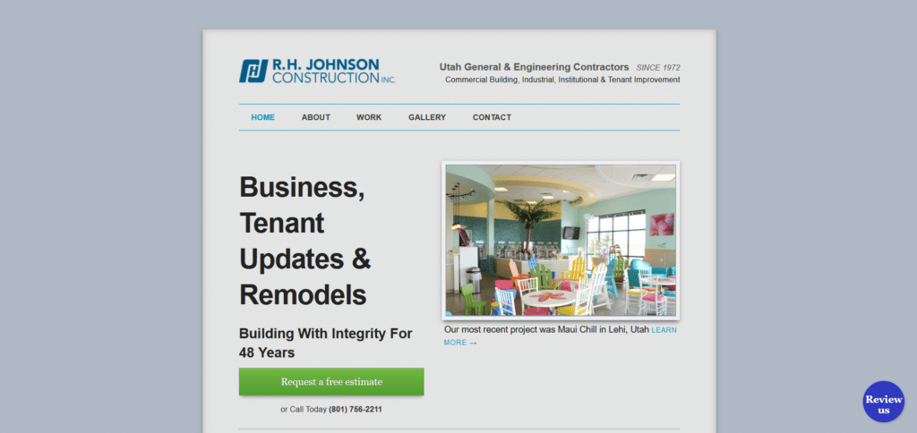
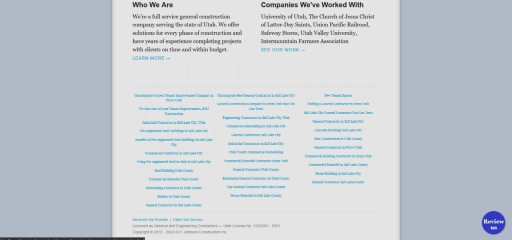
Homepages like this really feels like whoever designed this only wanted to do the bare minimum. “We’ve got our name out there and SOME info about what we do, we’re all good!” Why miss out on the opportunity to showcase more of your work on the front page?
You have 48 years of building experience and yet no section on the homepage about what your previous clients say about how they like your work. For the list of services and offerings is simply spread out like a grocery list that is overwhelming to anyone who’s just trying to find a specific information.
Squires Construction
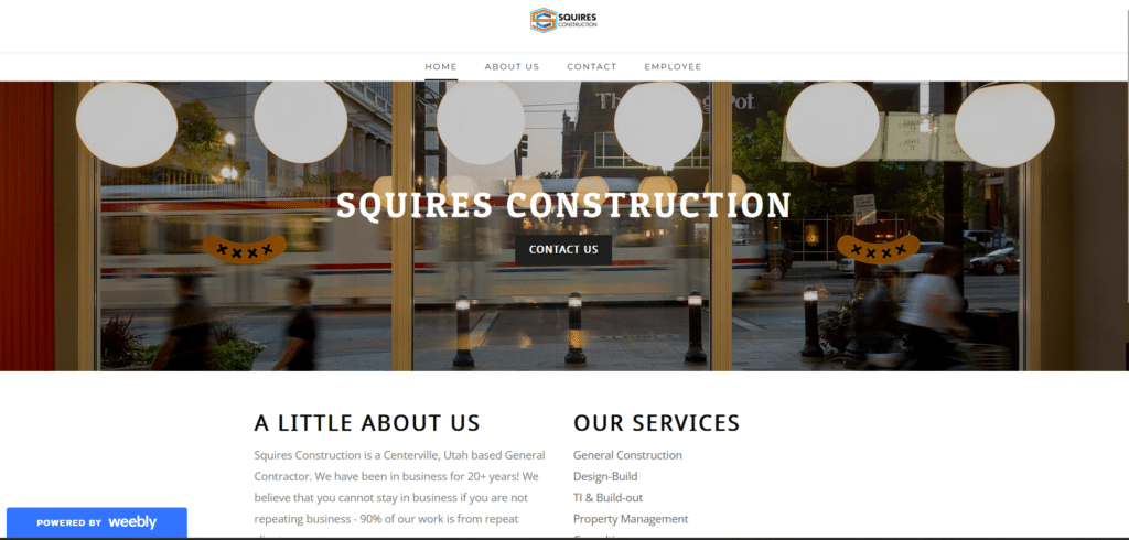
Again with the bare minimum. It’s such a missed opportunity if you already have an established homepage. Why not place simple elements like directions to your office, an address, or even your contact number so people can easily reach you?
Perhaps I can understand from their perspective that maybe updating the website might be a hurdle. Thankfully our team is capable of providing help for already existing websites and supercharging them so they can be rich in content that is sure to bring i more customers.
Read more: Super support for improving your website!
Boro Construction
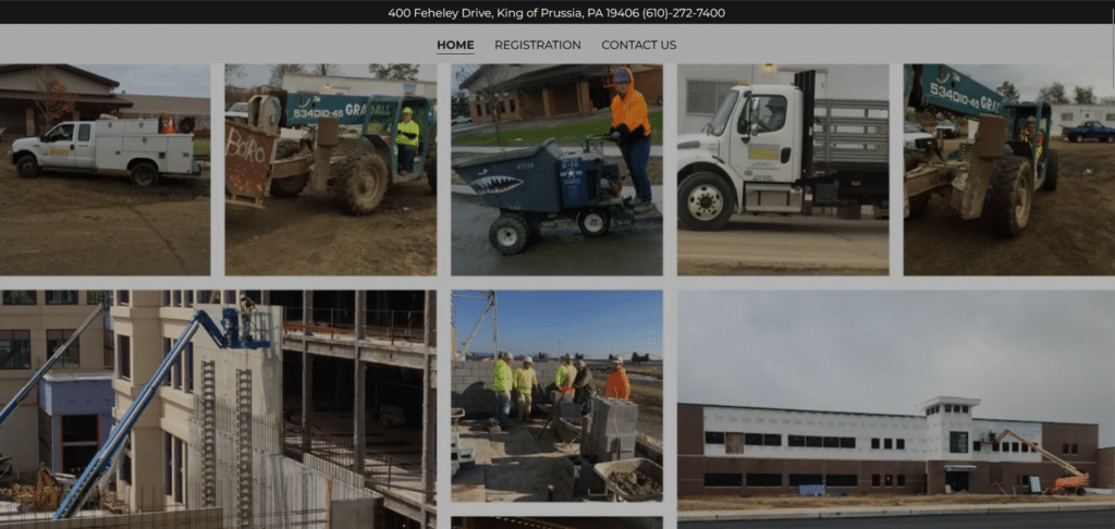
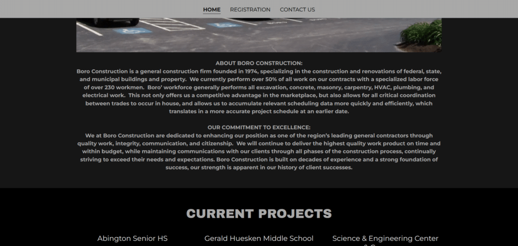
You know a badly designed room because of the little things you notice upon entering it. The lights are lacking, the switch is placed in an inconvenient area, the door doesn’t open to the right direction. In a homepage this kind of impression is also applicable.
Upon first look, the homepage should already tell people who you are and what you have to offer. Why populate the first section with a whole lot of low resolution photos. It’s so cluttered I didn’t even notice that their company logo was there until I scrolled up again.
Then there’s that pet peeve of mine: excessively long paragraphs talking about their company in a way that makes me want to stop reading after the first line. Strategize and organize! Design your homepages the way you design your buildings professionally.
Golden Eagle Construction Co.
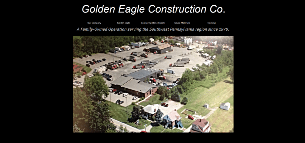
From the choice of the black void as a background, to the emptiness of this homepage, it doesn’t feel very encouraging to start building a project. It feels like one of those darkweb websites that’s not really comforting to visit. It’s rather sad because this is supposed to be a company since 1970.
Where are the project snippets? Where are the sections that explain what contributions they have made to their community? Where are the client testimonials? Is this company even existent anymore? Your homepage should be able to answer all those questions and more.
Hughes
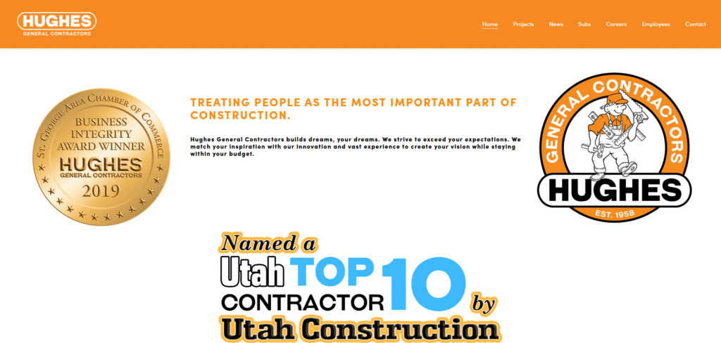
None of the beautiful homepage examples we have presented, plastered above the fold, the number of awards or recognition they’ve had. If there were any, they would discretely place this in a neat manner in the middle section or near bottom of the homepage.
Repeating your logo twice in a section of your homepage is redundant and does not provide value to your reader. Use your above the fold for providing 1-liner information or better yet, tempting offers to get new customers to sign up!
Build A Better Future For Your Company Online
Construction industry is highly competitive. You will find all these competitors striving to get the first place in the minds of their clients. Good impressions are important especially when customers know they have several options of suppliers available to them.
How you build that good impression is by starting with where they may first find out about you: online. Don’t take your homepage for granted. Use it to your advantage to build trust and even a following. It’s more often than not, that there are more customers than suppliers, you just need to build the bridge towards them.


