5 University Homepages That Need Some Fixing and Updating
Discover why modernizing your university's homepage design is crucial for engaging today's students and staying relevant.
Because schools know that their students will be the first critics of their websites, they’ve really gone the right path of designing beautiful and useful homepages. After all, if you want to be proud of your Alma mater they better have a good image online.
With that being said, it was quite a challenge to look for universities that were stuck in old homepage designs that break certain rules that we have for a proper homepage design. The ones in this list is not so much a harsh criticism of their design, more of they could use some fixes in specific areas.
Orange and Bronze Academy
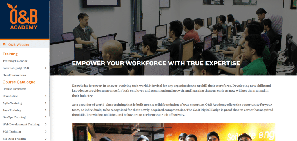
In terms of overall design, they didn’t do too bad. It looks rather clean, although the left side menu column feels different from the usual designs it was providing helpful links. To be fair, this isn’t actually a university but more of an Academic branch of a particular company.
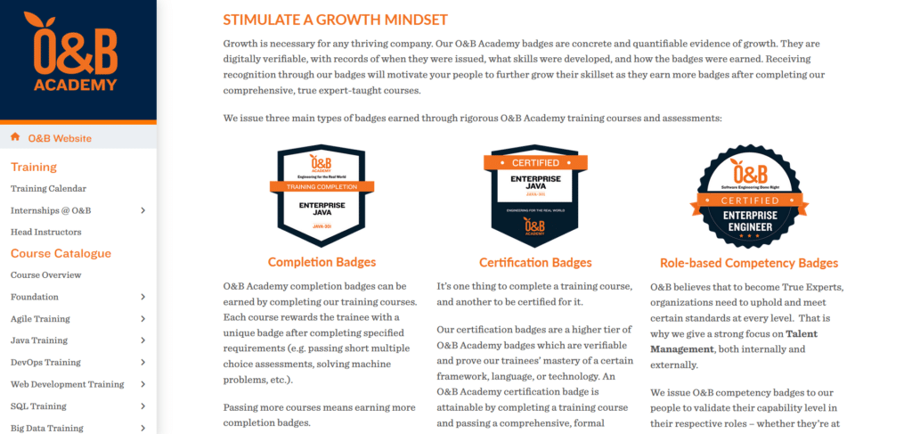
But that means if they want to encourage people to get in their programs, they need to simplify the information they are sharing. The badges are initially helpful but it’s just too much stuff to read on the homepage. There’s also very few call to action buttons to encourage engagement.
St. Paul College
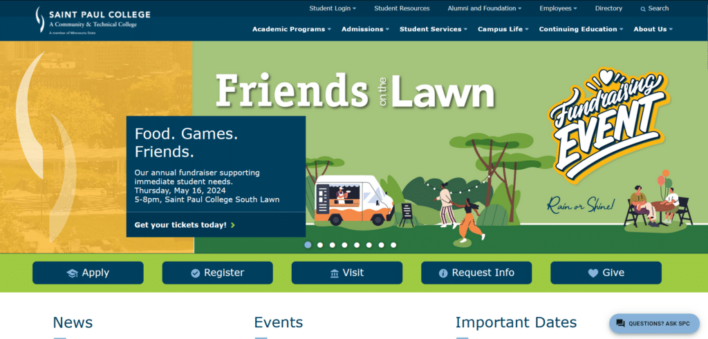
If you scroll down further, the homepage actually has some helpful content that is formatted in a way that gets you reading or at least, skimming. They’re not too bad. What I would like to focus on for this is the content above the fold.
Above the fold is where you get the initial attention of the website visitor. What you don’t want to be doing is getting your reader jumping all over the place with no sense of direction. Looking at their homepage your eyes will be all over the place not really knowing where to start reading.
Simplify the first section of your homepage and the rest of the other valuable buttons and content you can spread further down the page.
Thomas Edison State University
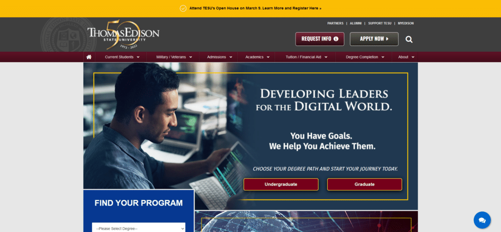
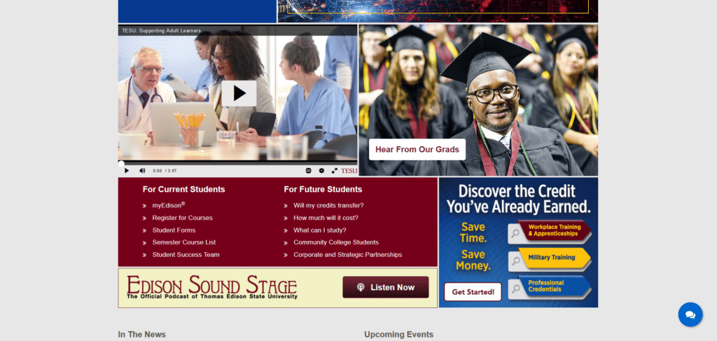
This one’s a rare one since most universities have already updated their homepage designs to fit what is more relevant to today. For this one it looks like a design back in the late 2000s. So many font types, too many font sizes, I’m not sure where to start looking.
Somehow I understand what they’re trying to do. You have a helpful “Find Your Program” form, there are some clear call to action buttons, and they even have a good use of focus item ribbons on the top of the page, all of which are good practices explained in the Xtreme Homepage Makeover guide.
For a homepage like this, changing into a more updated website theme could make a huge difference, after all wasn’t Thomas Edison a believer in innovation and technology?
University of Oxford
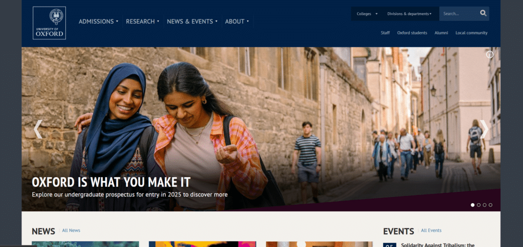
Oxford University is an institution that has held its own through the test of time and adapted to changes in the world. It was a bit of a disappointment to me that their homepage looked more like a news or media blog than a school homepage.
Other universities used their homepage as an opportunity to provide interesting information about their school or programs. They even have helpful search boxes to get the students looking into their courses. I don’t feel the reflection of Oxford’s standards of excellence in their homepage. There could have been a brief section about their campus, an excerpt to their history, or a carousel of their programs.
Maybe they’re confident with their name, there’s a complacency that can happen for some institutions when they establish themselves online.
NYU
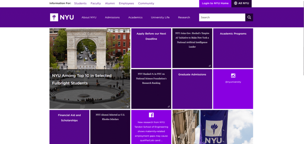
While most of the university homepages above need only a few corrections, this homepage really needs some reconsideration and probably a website overhaul. If there’s anything that I can compare this to is the long-gone windows mobile OS tiles. Even Windows had the realization that tile-based design isn’t really good for user experience.
For one thing, there’s not much distinction between tiles so there’s extra effort involved for the students to know where to click. If they want to highlight a particular content, it can only be done by putting up the largest tile with a very attention-grabbing photo.
On a mobile perspective you won’t be able to retain this mosaic look because it all is squeezed into this single column which doesn’t really look nice or professional.
Think Like Your Students
It is supposed to be the students who are learning from these educational institutions yet there’s still something to be learned from the behavior of the students on the website. Learning how the young generation interacts with content is not just for schools but for any website wanting to stay relevant much later in the future.
We need to keep up with the changes and developments in homepage design because user behavior is always evolving. If you are stuck with a design from 10 years ago, you can’t expect to be at the level of those Universities who knew how to adapt to new technologies and standards.
If you are unsure for yourself how you can make your homepage updated and relevant, we give free consultation for Universities, Organizations, and Businesses.


