10 Moving Company Website Examples to Inspire You
The Moving Company industry is one of the most competitive there is, especially if you’re new to the industry. Having a good moving company website is one of the ways your business will stand out right from the start.
The Moving Company industry is one of the most competitive there is, especially if you’re new to the industry. Having a good moving company website is one of the ways your business will stand out right from the start.
Having a good moving company website is one of the ways your business will stand out right from the get-go and add value as the doorway to your business through which your customers will get to you.
And because we at SuperWebPros love to support local businesses, we now bring you a list of Moving Company website examples to guide you and give you more clarity as you build one for your company.
1. Einstein Moving Company
Austin is an especially competitive market. These guys rank high in that market partially because their website is fun, friendly, and has a good user experience. Instead of stock photos, they have a featured video showing their team at work and custom icons that reflect their brand. The copywriting also reflects benefits and values clearly to customers.
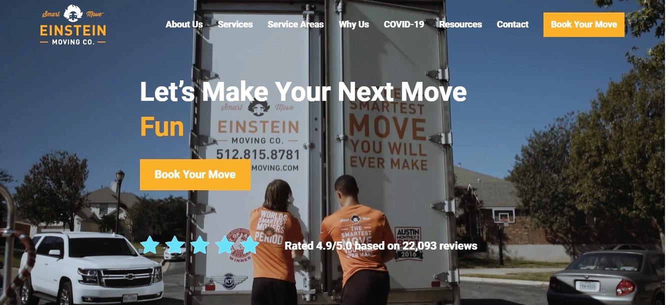
Source: https://www.einsteinmoving.com/
2. Blue Whale Moving Company
A super homepage design that’s not cluttered, no extra text just to fill up the page. They have clear calls-to-action to help generate leads and tons of reviews reflecting how good they are at taking care of people’s stuff.

Source: https://www.bluewhale.com/
3. MoveDay!
This moving company website example is what they meant by “a picture is worth a thousand words.” I don’t know about you, but this featured image gives me a feeling that these guys will hold your hand all the way into your new home.

Source: https://movedaymovers.com/moving-company/jacksonville/
4. Reeseo´s Movers
This is a clean moving company website design example with an amazing brand-specific color scheme and fonts that are easy to read. The website is also mobile-friendly.
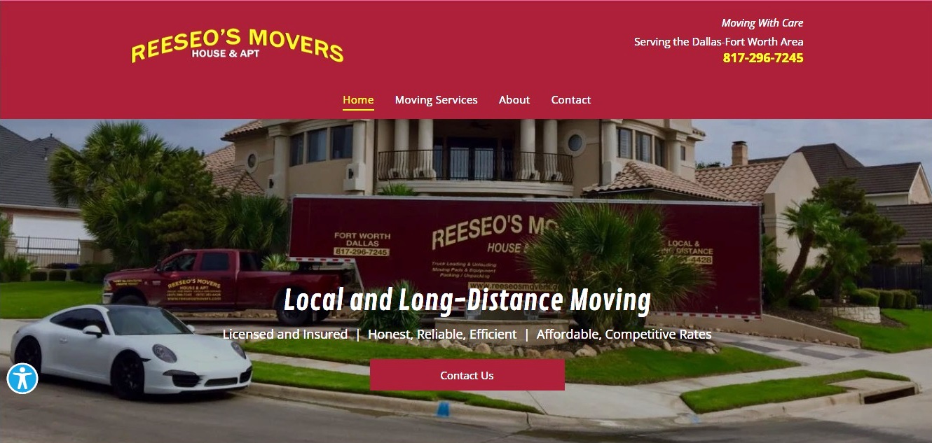
Source: http://www.reeseosmovers.com/
5. Mayflower
This is a custom web design whose colors are brand specific. There are real-life images for a more personalized touch, and making use of live chat on the website to connect with prospective and new customers.

Source: https://www.mayflower.com/movers/in/indianapolis
6. Shamrock Moving & Storage
With this moving company website example, customers have most of the information they need the moment the website loads, from their licensenumb9er information to your moving quote. This helps customers decide whether you’re the right fit for them and if they should go deeper into your website.

Source: https://shamrockmovingstorage.com/
7. Puget Sound Moving
The simplest web designs are often the best. This website is clean with a beautiful blue color scheme, clear calls to action, a few google reviews and it especially looks good on a phone or tablet.
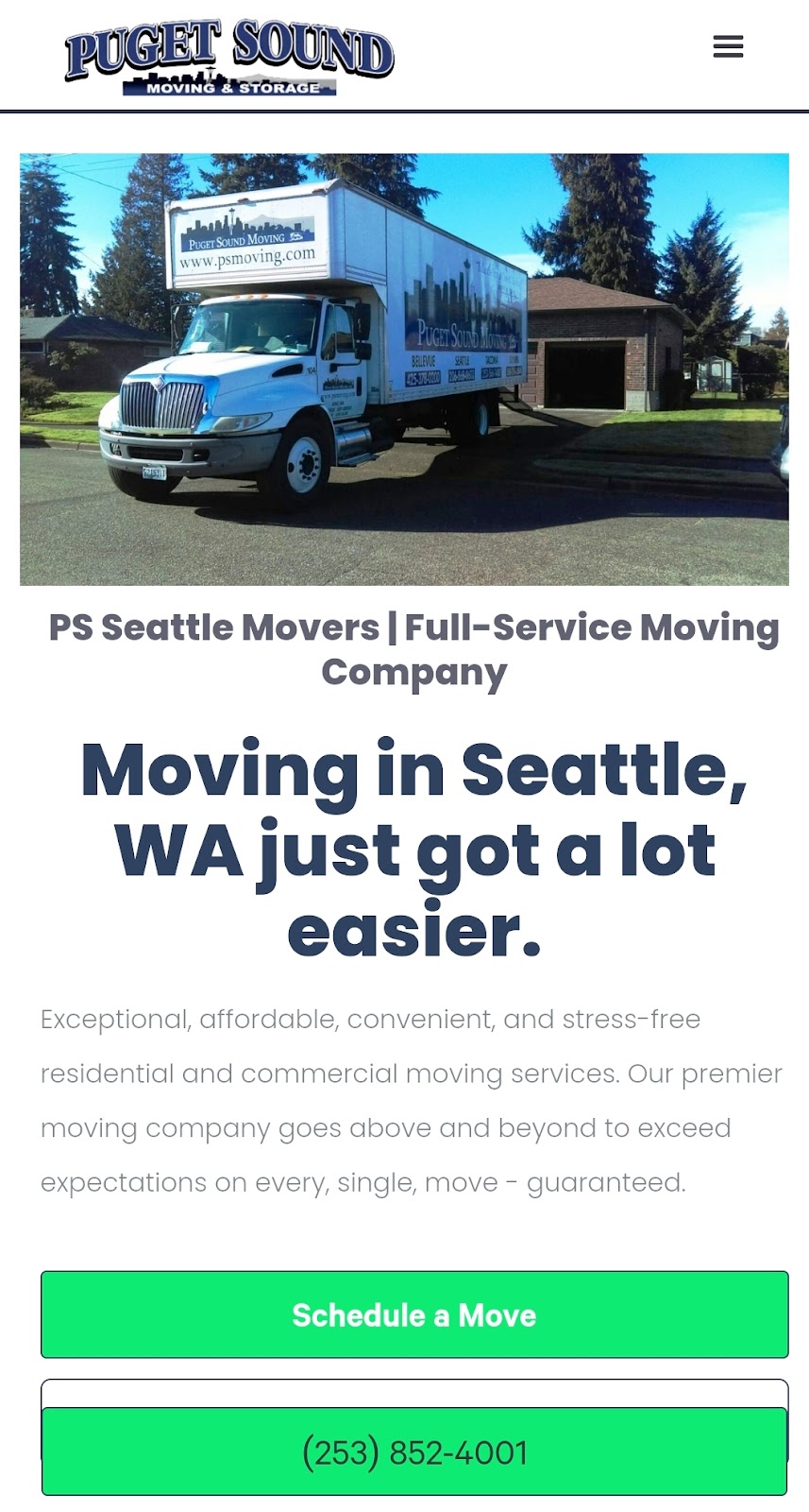
Source: https://www.psmoving.com/
8. Altitude Movers Denver
A moving company website this clean and concise enables the user to enjoy their experience. Add motion to it with an amazing animation technique and you’re sure to draw your user’s attention even more.
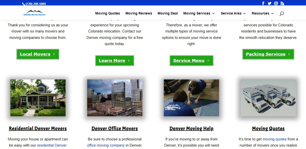
Source: https://altitudemoversdenver.com/
9. Two Men and a Truck
A clean, mobile-friendly, modern, and professional design with a featured video as their homepage header showing their team at work and custom icons that reflect their brand.
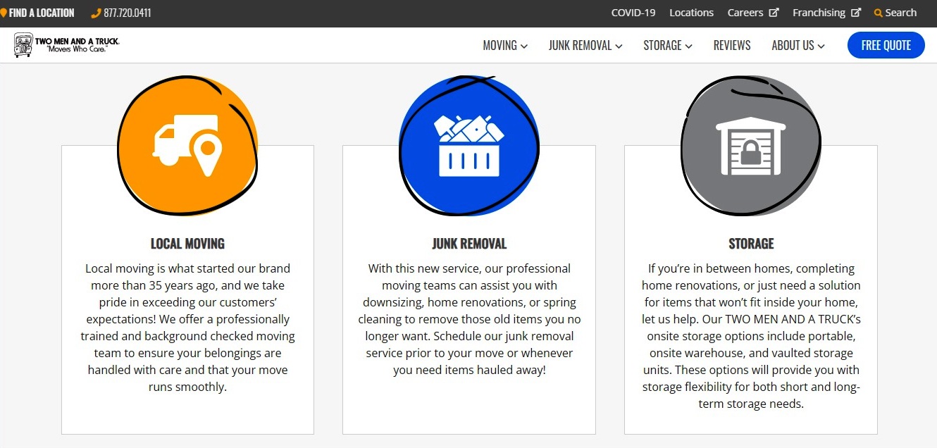
Source: https://twomenandatruck.com/
10. Pure Moving
A bold, brand-specific, artistic design with custom icons and well-animated testimonials as social proof of quality service and trustworthiness.
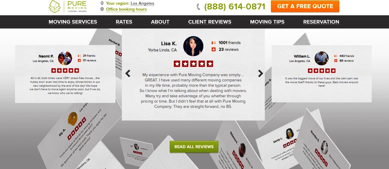
Source: https://www.puremovers.com/
What Do All These Moving Company Website Examples Have In Common?
A few moving company website design elements may vary here and there, but the basics are still the same.
Beyond having a clean, modern, bold, and artistic design, a well-designed moving company website should among other things be concise in its pages and content, clearly stating what the business is all about.
It should be mobile-friendly, have clear fonts that can be easily read, has engaging content through a blog, and it should also be search engine optimized so it can easily be found by customers.
And above all, it should have clear calls to action to facilitate lead generation and conversion.


